
The way they talk about it makes it sound like they invented the written word, but that notwithstanding the fonts actually look really nice in my opinion.
People actually change fonts in their IDE? I’ve always used whatever the default is and never even thought about it.
Try Fira Code font
I’m a big fan of Fira Code! I haven’t found any others I like more.
Love Fira Code but recently switched to https://typeof.net/Iosevka/ and it’s equally great.
You just made my day. Thank you.
I actually have. I didn’t install it in an IDE, though. This font comes with popOS
I always do. I’m a fan of JetBrains Mono.
It is the default font. At least in all the JetBrains IDE
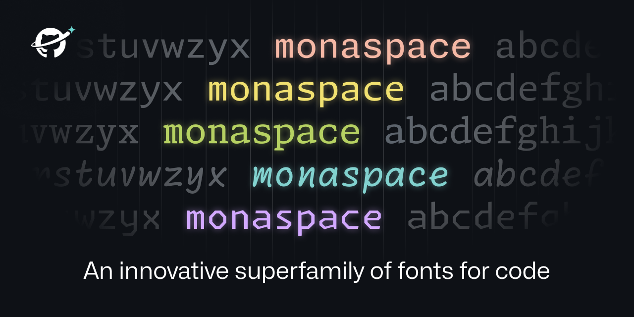
What makes this unique is that they’re saying this allows for different fonts in the same piece of code. So you could have comments in one font, your code in another, AI written code in another, etc. Looks like all the fonts are the same size, so everything still aligns nicely.
I’m an Envy Code R fan myself.
some people even change default system fonts used in the deskop environment (menu’s, filemanager etc) 😎😁
Damn, I need to get out more.
Actually you have to stay in more to get into this sort of thing.
I was also like that until I discovered ligatures were thing.
I’ve always preferred IBM’s Plex Mono, specifically the Nerd Fonts version.
I can’t stand Jetbrains default font. The height of the letters is too large
Oh man fonts for coding are such a huge thing. There are people making their own forks of so they have certain glyphs, or a line through the zero (or vice versa) or little changes to other specific chars.
Calling it now, Radon will become the new Comic Sans.
Honestly I could see radon for comments only. It makes it clear that it’s a comment by the font alone.
Except I like reading the comments…
I can too. I’ve seen something like that before. It was interesting, but not interesting enough for me to care about it as a feature.
not on my machine! every time someone posts a screenshot with a handwritten font it’s less readable and looks bad
Yeah, I looked at the first couple of fonts, then read all that stuff about readability this, state of the art that, expressive palettes la-di-da and I thought “ok maybe they have an idea here”.
Then I looked at the rest of the examples and ran into that… thing. Like, the fucker’s so aggressively irritating to read that you could use that font to hide eg. backdoors in code, and reviewers would instinctively skip over those parts just to avoid the pain.
I mean, Comic Code is pretty damn good.
I can’t believe how no one seems to have mentioned how beautifully made this website is though. Absolute pleasure to scroll through on mobile.
That was interesting how they adjusted sizes based on adjacent letters. Good idea
Great idea but the name texture healing is terrible. It’s not healing anything and there are no textures with fonts. Dynamic or flexible weight makes a lot more sense.
I agree that texture healing is a bit too vague about that they’re really using it for. Its really for kerning pair without disrupting the monospaced grid. Maybe, since the audience for these fonts aren’t usually typographers, they should have called it Monospaced Kerning Pairs?
Texture is a term and feature of typefaces in design however. Usually described for fonts used in body text, or larger blocks of text.
While it probably doesn’t affect shorter lines of text used in most coding languages, it can be harder to read when smaller sizes are used. Monospaced MmWw are the worst culprits.
One memorable observation on typographic texture was made by Heinz Peyer, a Swiss poet, who said that reading a text composed in Helvetica was like walking through a field of stones, whereas reading a text in Syntax was like walking through a field of flowers. (23)
Form is often susceptible to logical analysis, and pattern somewhat so, but texture evades precise description because its repetitions are so numerous, its features so small, and its interactions so refined, that the multifarious complexity of the emergent image resists orderly analysis. Texture requires a holistic more than an analytic under standing.
Ironically the second paragraph is turning out to be largely incorrect with smarter ways to analyze blocks of typeface texture. Also this second paragraph nicely illustrates the utter wankery present in a lot of typography circles and analysis.
Gotta justify that grad school bill somehow (pun intended).
Edited for spelling
Oh interesting! In that vain, it does make sense. Thanks for taking the time to explain that.
Getting major Marvin Gaye vibes.
When I get to squinting, I want… textural healing
Like kerning pairs, but with character swapping instead of kerning adjustments. It’s a really clever use of the language features available in Unicode.
Too bad I’m married to JetBrains Mono.
Does anyone know if Jetbrains Mono also does the whole dynamic width thing?
Don’t think it does.
Could elaborate on what the “dynamic width thing” means?
The text healing that is mentioned in the link
Like how Neo flexes in the hallway and the entire Matrix flexes around him, except with wide letters like ‘m’.
Letters like m and I are still same pixel width, you just use function of openfonts to shift letters and replace with wider version where possible.
#[ i ][ w ]
Becomes
#[ i ][\/\/]
I broke up with JB Mono a while ago :'(
I like Hack as my font of choice, but I will probably give this a shot. It’s a font, there is no risk of data collection, Microsoft style bugs, or other Microsoft-associated product issues.
It’s a font, there is no risk of data collection…
TeamViewer checks for a font their app installs when visiting their website to fingerprint you.
deleted by creator
In my web browser I personally use uBlock Origin to just block all remote fonts and browse with a JS disabled by default policy. It’s an annoying but necessary compromise, in my opinion.
Also, in Firefox v118 a new feature was introduced to curtail the font fingerprint route as well: “The visibility of fonts to websites has been restricted to system fonts and language pack fonts to mitigate font fingerprinting in Private Browsing windows.”
I’m sure you know this, but for anyone else scrolling through the comments it is actually ridiculous how much data websites can query and receive to fingerprint users from the web browser. Just look at https://amiunique.org – “WHY IS THIS ALLOWED?” is the question I have asked for many years now.
“WHY IS THIS ALLOWED?” is the question I have asked for many years now.
Because people want to have features in their web browsers and originally no one really designed the web with security in mind.
Some of it is incredibly difficult to imagine how to do in a private way, too.
For example, my browser can display AVIF images. If my browser announces in the Accept “hey, I’m able to display AVIF images. Please send me AVIF images if you have them rather than JPEG”, that helps to identify me, since most browser don’t display AVIF, which sucks. But I really want to get AVIF images: they’re efficient. So how do I announce that I want AVIF images without announcing that I want AVIF images?
Some of the other web features were well-intentioned but have just ended up being useless. Like your browser also announces what language you prefer. Like “hey if you a German version of this text, please send it to me in German, thanks”. But for some reason EVERY WEBSITE IGNORES THIS and just says “oh you speak Spanish and English but you’re travelling in Russian right now? HOPE YOU LIKE READING RUSSIAN FUCKER”. So it’s 100% only used for invading privacy now.
Some of the tracking mechanisms never should have been allowed in the first place (like timezone and which fonts I have installed), but some of them (like Accept) I can’t think of how to do in a secure way.
That is insane the amount of info given. I had no idea. Thanks for the website
Fuck me sideways.
Also, I’d remove battery charge metric from the fingerprint. Since it changes over time, I wouldn’t really consider it a good or even usable metric.
Could be used in combination with other metrics to identify a specific user’s movements through a site over time, if the other metrics aren’t unique enough.
Possibly, but when you have time as a realiable metric already, you dont need another metric that ticks down at an unknown and inconsistent speed, and goes up once in a while. Hell, I keep my laptop plugged 99% of the time.
I used Dejavu Sans for like 10 years, and Hack is the perfect incremental improvement. I’ve tried to use other fonts but I keep coming back to Hack.
https://security.stackexchange.com/questions/91347/how-can-a-font-be-used-for-privilege-escalation
Not a serious rebuttal. But yes, MS has found a way for Windows to be vulnerable to attacks using fonts.
What the…
I meant to link the CVE sorry. https://cve.mitre.org/cgi-bin/cvename.cgi?name=CVE-2011-3402
sorry i already have comic shanns for that
Thanks I hate it
I’ve used a similar comic-mono font for a while and it was really good! I don’t like how lots of mono typefaces are angular or sharp.
That doesn’t look half bad, actually!
i use it in visual studio code and it looks really nice!
Oh I’m gonna have to give that a try, thanks!
They really look nice. A good font makes a huge difference.
I’d never bother changing whatever default font the editor comes with and I don’t understand why anyone would care to
Some people care more about having fancy tools than actually doing work with them.
On reddit, I used to subscribe to the VS Code subreddit. A lot of posts were just about themes, people asking “what theme is this” or posting their latest minor recolor. Meanwhile, I’m there for posts about actually using the damn thing.
You are correct, but I find dialing an easy-on-the-eyes colour and a good font reduces eye strain. It lets me keep the font size small with less fatigue especially as my eyes (and I) age.
As for what theme? Usually it’s as simple as browsing through the presets until one jumps out. Takes a few seconds. Having more presets adds about 2 seconds to the process and often (not always!) results in an even better choice. Have no idea the name of the theme I end up with.
Besides, tweaking this can be fun if you’re between thoughts - you end up learning the inner workings of the environment.
Very interesting technique to get the widths of the glyphs uniform without them looking ugly in most cases. OK, one can make it look bad if you know the “pain points” of the system, but in normal flowing texts, the fonts do look good.
deleted by creator
Looks lovely! The art of fonts is something I will never understand but always appreciate. This website is also brilliant in showing everything dynamically and explaining why it all matters. Safe to say Github will start using it everywhere? It’s also open source, which is nice (and makes sense considering what Github is striving for).
Edit: Not 100% sure on texture healing though. Toggling it on and off in the example makes me feel like texture healing makes everything look weirder. It makes the font look less monospace which should be good, but it just messes with my mind when some letters look slightly different in different contexts. Like the spacing is not immediately obvious to me and having the same letters look different is throwing my mind in a loop. I guess I’ll need to try it to see if it’s comfortable.
https://www.programmingfonts.org/#hack
You can check out fonts here and filter based on mono spacing, ligatures, etc. Hack is by far my favorite font but I just wish I could use it with nerdfont/jetbrains ligatures. It just has this beautiful way of being able to look open and readable while taking up less space than fonts like fira or jetbrains.
Cool for them for making a font, but personally don’t think it’s up to firacode, hack, jetbrains or many other fonts out there
Wait, why did they invent the phrase “texture healing” for literally what all mono space fonts try to do: make a monospace font that doesn’t look like cluttered shit.
Wait, why did they invent the phrase “texture healing” for literally what all mono space fonts try to do: make a monospace font that doesn’t look like cluttered shit.
They explain it as the same way cursive fonts can have variations on the letters so that they match up (the loop of the y into the e for example). I think it works by having various versions of each glyph: normal, wider to the left, wider to the right, etc) and then pick the glyph based on the surrounding ones.
Because otherwise they couldn’t justify their continued work on things nobody asked for.
Also, those letter combinations are called ligatures, and are generally a bad idea in monospace fonts. The point of them is to make it very clear where one character ends and the next one begins.
Pretty cool actually, though I highly doubt this is an innovation. Good for them if they’re actually the first font to do this
Not sure if you misspoke or are just unaware of it, but Hack is one of the prepatched nerd fonts: https://github.com/ryanoasis/nerd-fonts/tree/master/patched-fonts/Hack. Also, for any fonts that aren’t prepatched, there’s a patcher in that repo to make any font a nerd font.
oh wait you’re right. I wasn’t having luck with the nerd fonts on windows but on linux it was somewhat better. what I was thinking about was having Hack with nerd fonts and Jetbrains ligatures patched in. I found a couple repos that purported to do that except the ligatures never worked.
Such a subjective thing and often heavily based on familiarity, but looking at that solidifies my appreciation for Ubuntu Mono
That’s a nice one!
This is the one I use.
I didn’t think I had strong opinions on fonts.
Turns out I viscerally despise “handwriting” fonts. They’re harder to read. It just makes me recoil.
I also intensely dislike "ligatures " that turn like
==into a separate glyph. Or the one that turns=into the > with the line under it. No. Stop. That’s not what I typed. That’s not what I’m looking for when I scan the text.Side note: I assume someone is feeling clever and is thinking of replying with a handwriting font message with ligatures. You don’t have to. I already imagined it.
The texture healing seems cool though, but I didn’t immediately notice or understand until I read through the detailed section on it.
I personally like ligatures when I’m programming. It took me some getting used to, but now I can’t live without them due to how distinct it makes the code segments. I fully understand disliking them though. Thankfully fonts like source code pro allow disabling features like ligatures and their godawful handwriting styled italics, so you’re able to use just the parts you like.
That Krypton font do looking nice
Yeah, like, since when does Microsoft put out something both functional and cool, ya know?
Like Age of Empires?
Well, their previous fonts are nice, Calibri etc
Having different font styles depending on the context is a really nice feature. I’ll definitely give it a try.
It’s a cool idea and the example they gave actually seemed pretty neat.
I’d (somewhat perversely) love to see this feature tried in a terminal emulator. ANSI does actually define escape codes for switching to alternative fonts (ESC [ 10 m through ESC [ 19 m) though I don’t know of any software or even term drawing library that uses it.
That would really be neat.
Kitty terminal has a lot of configurations for fonts. I beleive you can get down to adjustments for specific charecters. Idk if it uses the specific technology you are suggesting. But it is explained in the kitty.conf docs.
A lot of code editors support that without the weird “healing” features they laid out here.
VSCode has pretty decent semantic based formatting options.
I’m a simple man, I just use DejaVu Sans Mono without any ligatures or other fancy stuff.
Works everywhere.