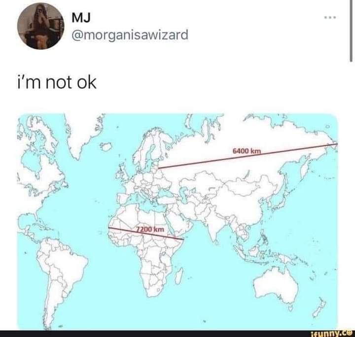
Isn’t there a flat map where the actual scale is kept intact? That fucker looks so weird when you’ve been taught the other one your whole life. It’s like planetary dysmorphia.
This is what us Aussies have been trying to say! We’re not that much smaller than the contiguous USA. Yet so often online people act like we’re this tiny island. It’s just our population that’s tiny by comparison.
I’m from the US, and I’ve always pictured Australia as a place nearly the land area of the lower 48 states, with people along the coasts and one city right in the middle.
In the US, we assume the difference in population is due to attrition due to dropbear attacks. We’re not entirely sure where we got that information, but it seemed pretty reliable.
Many map projections do one thing well at the cost of sacrificing others. For example, the popular Mercator projection (which you’ll see in many US schools and textbooks) is well suited for marine navigation but is exceptionally distorted the closer you get to the poles.
You can easily do it without distortion. The issue is continuity. You’d have to make cuts and effectively unwraped the globe like you would a 3D sphere. Some countries might literally be cut in half, but it would at least be accurate
Effectively no. Any projection of a spherical surface into 2D will distort it in some way. If I understand correctly, the Mercator projection (which I think is what we’re looking at) is a cylindrical projection, which preserves latitude but severely distorts longitude near the poles.
I do know that aeronautical charts are conical projections, which is fairly distortion free for the relatively small area they cover, but you can’t lay more than a few of them edge to edge before things stop lining up.
You have distort some thing. Scale or directions. The one most people use keeps directions constant. Ie a 45 degree line between North and east will akways point due northeast no matter where it is.
Contrast that with a map that cuts out large triangle sections or naos that have tge equator wider then poles. These maps make true northeast variable.
No, but there are several better projections. The Mercator is a nautical chart, it was never intended to be used as a general purpose map of the world but for some reason it’s used that way.


Isn’t there a flat map where the actual scale is kept intact? That fucker looks so weird when you’ve been taught the other one your whole life. It’s like planetary dysmorphia.
https://thetruesize.com/
Fascinating, thanks for sharing!
Australia and China are absolutely massive, wow. They look deceptively small on most maps 🤯
This is what us Aussies have been trying to say! We’re not that much smaller than the contiguous USA. Yet so often online people act like we’re this tiny island. It’s just our population that’s tiny by comparison.
I’m from the US, and I’ve always pictured Australia as a place nearly the land area of the lower 48 states, with people along the coasts and one city right in the middle.
In the US, we assume the difference in population is due to attrition due to dropbear attacks. We’re not entirely sure where we got that information, but it seemed pretty reliable.
That’s a cool site, thank you for sharing it!
No, it’s not possible to take a 3D surface and to transpose it onto a 2D plane without any distortion.
This is true. There are some projections that show area more accurately, or shape of landmasses, etc.
For example:
Many map projections do one thing well at the cost of sacrificing others. For example, the popular Mercator projection (which you’ll see in many US schools and textbooks) is well suited for marine navigation but is exceptionally distorted the closer you get to the poles.
I kinda like how the Kavrayskiy VII projection looks. It appears to preserve both the area and the shape fairly well.
this kind of projection is my favourite, it just looks like a map that belongs on a wall
Which makes perfect sense for its use case - navigating from Belgium, Portugal and Spain to Africa, India and Central and South America.
You can easily do it without distortion. The issue is continuity. You’d have to make cuts and effectively unwraped the globe like you would a 3D sphere. Some countries might literally be cut in half, but it would at least be accurate
There will still be distortion, just less. The more cuts, the less distortion. But you can’t make an unwrapped sphere lay perfectly flat.
Erm, yes you can, just run it through the infinite-cuts device!
Or without chopping it up in an odd way rather than a rectangle.
My fucking…
UV MAPS
AGGGGGHHHHH
Effectively no. Any projection of a spherical surface into 2D will distort it in some way. If I understand correctly, the Mercator projection (which I think is what we’re looking at) is a cylindrical projection, which preserves latitude but severely distorts longitude near the poles.
I do know that aeronautical charts are conical projections, which is fairly distortion free for the relatively small area they cover, but you can’t lay more than a few of them edge to edge before things stop lining up.
You have distort some thing. Scale or directions. The one most people use keeps directions constant. Ie a 45 degree line between North and east will akways point due northeast no matter where it is.
Contrast that with a map that cuts out large triangle sections or naos that have tge equator wider then poles. These maps make true northeast variable.
deleted by creator
There are many different world maps, and some have an intact scale. But they lack in other ways.
Map Men has a good video about it:
https://piped.video/watch?v=jtBV3GgQLg8
No, but there are several better projections. The Mercator is a nautical chart, it was never intended to be used as a general purpose map of the world but for some reason it’s used that way.