
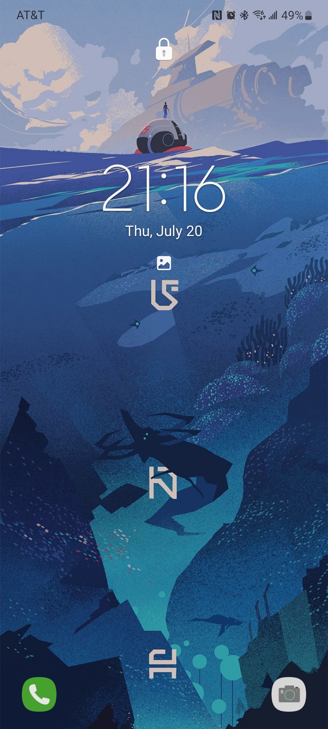
Despite its failure to capture a significant market share, I really enjoyed the metro UI on windows phone and tablet. One UI on my Samsung was getting stale and has a nearly unusable apps drawer, and standard Android notifications are nagging and ungainly.
So I went looking for launchers and icons to get my live tiles back, and what do you know, these are available and they rule. Sharing here so others can try, plus a killer home screen background for good measure.
Apps: SquareHome and WHicons
Squarehome is surprisingly thorough in replicating live tile functions - all apps which are capable of image notifications will display on the home screen with a pic and summary/text right on the icon. You can dismiss with a long press, and exclude any apps from notifications that you prefer.
The consequence of this is that you don’t need to use the android notification list at all if you don’t want, and by getting selective you can avoid the bombarding nature of android style alerts. I actually find myself checking the apps LESS, and I consider it a good thing.
The launcher also gives you some interesting options for hiding the ever-present android interface: you can hide the top bar while on the home screen(s), as well as the nav buttons. You can enable scrolling instead of paging for your home. There are built-in shortcuts to storage, settings pages and configurables (silent mode, wifi etc).
Tile sizes are fully customizable. Included widgets are compatible with the major productivity suites. (Switched to outlook as you might imagine). Most users suggest using WHicons for the right look, which has a few thousand icons that automatically apply to the appropriate app.
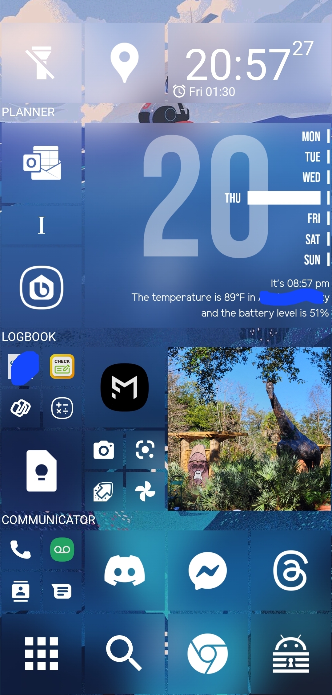
App drawer has a list function if you hate the Samsung UI app moshpit. And I do. It also has a full suite of software and hardware shortcuts for things like ‘activate flashlight’ or ‘load a file using this application’.
Spent a few days fiddling, but I couldn’t be happier with it now.
The background is by u/jmlan
Holy Fuck! That home screen is ridiculous.
I have NOTHING on my home screen.
I have quick access to fav apps on a sidebar and all other quick settings from the top pull down.
This is a mess! Ewwww … NO!
I feel like there are kinder ways to express your opinion than to say “ew” about something someone made for themselves…
That’s ok lol, it’s just a phone! My goal is to treat it as a tool, vs just scenery and this is more configurable than the standard Android grid. I don’t think anyone is being mean, but the extreme range of opinions is pretty funny!
It’s busy but it looks similar to how I’ve been wanting to set up my home screen for ages. I have the standard grid right now but I took a look at some widgets and I’m having a vision of a brighter future lol. Redoing my home screen will be my self-care activity this weekend haha
If it helps, I’m left-handed, so it’s grouped in a sort of arc from the bottom left corner - apps for quick one-handed use are inside the arc, and the rest is either informational or the start point for a more involved activity like web browsing. It looks ‘cluttered’ because I didn’t really lay it out as a generic or intuitive interface, but specifically to match my needs and habits. I think a home screen should be utilitarian - ‘pretty’ is for lock screens. Hope I didn’t send you down too deep a rabbit hole - Although sometimes that can be fun, so good luck!
Yuck! That better?
Ahhh, A fellow nothing enjoyer. Cheers!
For all other nothing enjoyers, I’d heartily recommend Niagara launcher. I can count on one hand how many apps I’ve paid for the premium version, and it’s worth every penny. My home screen is de-cluttered as fuck, and all it takes is a simple swipe up or down the left/right side of the screen to pull up an A-Z app list, where you can find any app you’re looking for in under like 2 seconds tops. No buttons, no typing, no bullshit.
Can keep as many or as little apps on the home screen that you like, although it removes the multi-window option completely, which makes using widgets a little more challenging if you use a lot of them. You can have a “widget stack” you can swipe between on the home screen that only holds 4 widgets max (although you can nest more stacks elsewhere) but since I only need a calendar and notes, that’s more than enough for me.
I absolutely hate how cluttered Android phones have always been. Used Nova for a while to have my frequent apps available in the app drawer where my thumbs could reach them; now I’ll never switch away from Niagara. Has a free version, so try it out and see if you like it!
naah i will keep using kiss launcher.
I am similar with my laptop. I keep all desktop icons hidden because it looks clean and great.
With my phone, I only use the bottom quick launch row for icons.