
For what i heard, a lot of people on the Linux community use Krita for image manipulation, even though, it’s intended for digital painting, and GIMP is the one intended for image manipulation, because people don’t like the GIMP’s UI.
My issue is, i never understood why they don’t like the GIMP’s UI, since i never have issues with it,(Although it’s probably because i’m used to the UI) so i need to adress this problem and ask you What does the GIMP UI has that you don’t like or hate so much and why you like Krita’s UI over GIMP’s?
Before you event comment your answer i need to ask you to do the following:
-
Address each specific issue along with an concise and direct explanation of why you don’t like it
-
Answers such as “I just don’t like it”, “I don’t like where it’s placed” or anything alike doesn’t count as “Concise and Direct”, we are adults, not 4 year old children.
-
If you can provide a suggestion of how GIMP’s UI can be improved, it would help a lot, and maybe this issue can be solved.
-
If someone else commented something you were about to comment, upvote them, this way we can address the most common issues effectively.
-
I need you to watch the screenshots of both UI’s, because something that most people don’t know, it’s how similar Krita and GIMP’s UIs are.
Krita’s UI

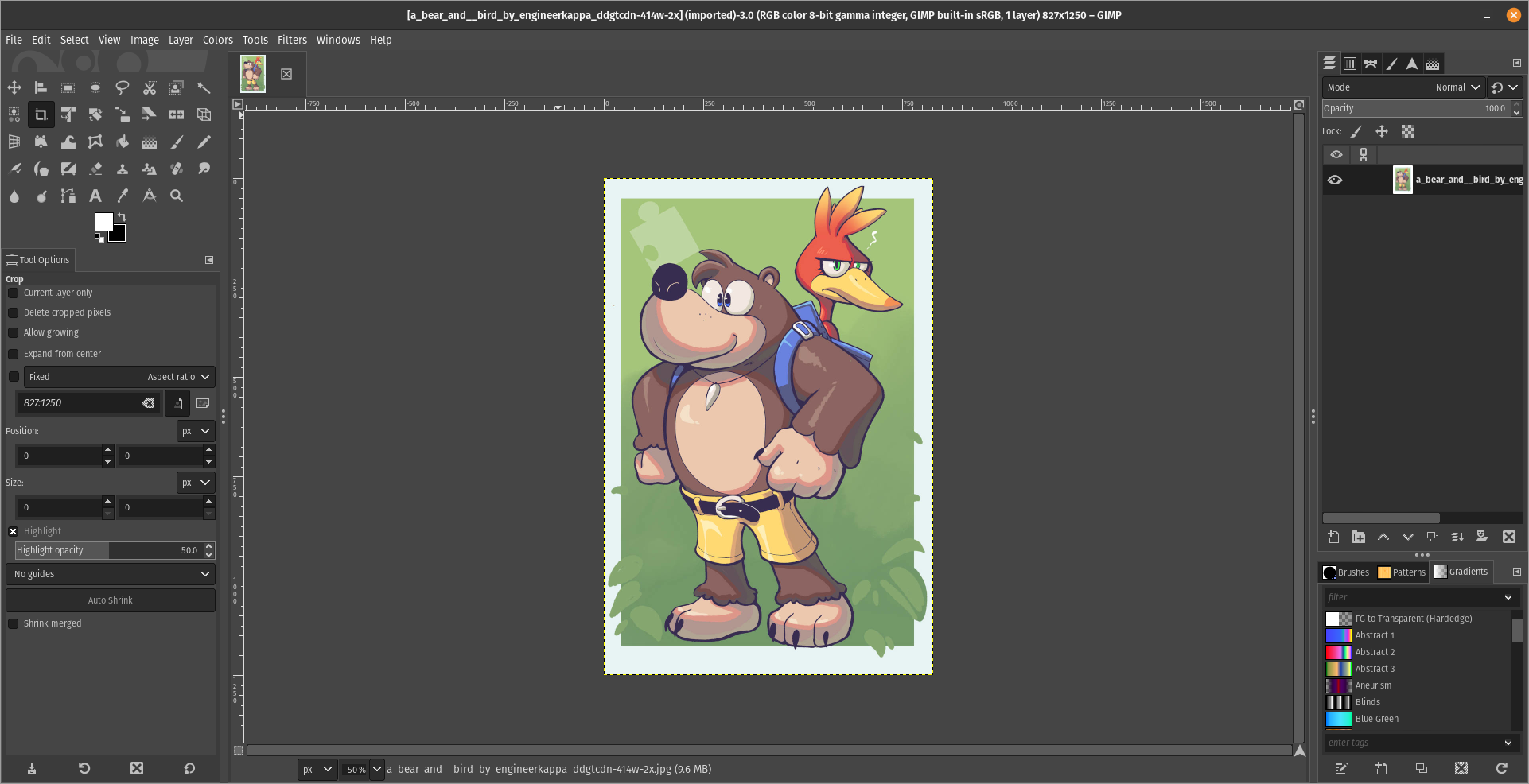
GIMP’s UI
(Credits to a friend of mine for lettig me use the screenshots.)
My ideas on how GIMP can improve it’s UI
-
Adding the option of the new UI selected by default, but with the possibility to switch to the new UI.
-
Possibly addding “work spaces” like Krita would help too, along with the possibility of exporting and importing them, this way people can have custom arrangements of the UI according to the kind of work they will do.
Thanks for reading and hopefully we can address this issue effectively.
I have not used either, but I can say that Krita’s UI is closer to Photoshop than GIMP’s appears to be. That might be why people are opting for that application, for the sense of familiarity if they were trained on Photoshop.
I will say that any application which is used for digital painting should also be good at image manipulation, so if Krita does both well, I can see why it would be preferred over GIMP if the painting tools are lacking.
Looking over the screenshots, for GIMP, I am hoping that is not the default layout of tools. Having a jumbled block of icons is a lot harder to visually parse than a stack of pairs. I also find myself wondering why they use up so much space on the left to include a weird cutout of their mascot above the tools.
On the right, I am also not sure why the layer thumbnails are pushed so far to the right when they could be immediately adjacent to the visibility toggle.
It doesn’t look terrible to me, but I am not surprised that people using an app for visual design might be more critical of design flaws in the app itself.
Krita lacks a lot of tools to work with photography. It’s OK with general image manipulation but you have to really struggle to do anything that’s not digital painting.
That said. The left side of GIMP is wide because the tool options are under the tool’s icons. While Krita has them on the top as a bar.
Both programs let you move and change the layout to whatever you want, though. No one serious about using either program uses the default. There’s a bunch of stuff you don’t need to use that only takes up space when you’re just doing one particular task. Hence why saving and reloading layouts is such a powerful feature.
EDIT: Here is, for example, my layout.
Also, the little logo on the corner has a purpose. It’s a small area where you can drag and drop any image file from your file explorer and it will automatically open the file for editing, instead of pasting it on the current open project as a new layer. It’s super useful.
That does look better.
For the drag and drop space, however, would a simple “Right Click > Open In” not be easier? Or just dragging the file over the application on the taskbar?
It’s there for convenience. Easy is a very subjective term in this context. Everyone has a different concept of what is easy on a computer. The fact that drag and drop has two, completely differentiated but equally instantly available verbs, is already above and beyond the amount of options other software packages offer.
Hey look, voilá, this is entirely possible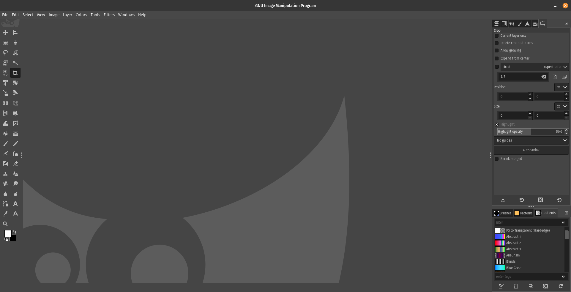
You know you can change the UI and Keybinds to make it more alike to Photoshop, right?