Yes but the other two services are desirable, so I almost clicked accept all. Also the consent button feels like it has a more attractive text than the reject button.
That gray text right above the buttons suggests there there won’t really be any negative impact, despite their desperate pleas right above it. I don’t know, if this was me, I would definitely click Reject All and then see how messed up the resulting website ended up for me.
The psychological profiling that went into making equivalently styled Accept and Reject buttons look different to a reader is almost certainly intentional, though. Reminds me of the Redact app and how they would show you a crying kitten if you didn’t share using their (previously free, now expensive) app on your Twitter profile.

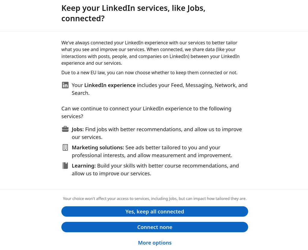
“Connect none” is right there, though.
But I kinda glossed over it the first time I saw it.
Usually two opposing buttons will be next to each other, not be one on top of the other, won’t they?
Yes but the other two services are desirable, so I almost clicked accept all. Also the consent button feels like it has a more attractive text than the reject button.
That gray text right above the buttons suggests there there won’t really be any negative impact, despite their desperate pleas right above it. I don’t know, if this was me, I would definitely click Reject All and then see how messed up the resulting website ended up for me.
The psychological profiling that went into making equivalently styled Accept and Reject buttons look different to a reader is almost certainly intentional, though. Reminds me of the Redact app and how they would show you a crying kitten if you didn’t share using their (previously free, now expensive) app on your Twitter profile.
At the end of the gray sentence it says it impacts how tailored the service is. It’s something that would be valuable to me in this case.
They should’ve shown a happy kitten instead.