

- cross-posted to:
- LemmyClient@lemmy.world
- cross-posted to:
- LemmyClient@lemmy.world
Hi there fellow Apple enthusiasts!
Yesterday I announced that my native iOS app for Lemmy called Avelon is finally ready for testing, and I figured some people here might also be interested in checking it out!
My focus for the app has been performance, design and ease of use. As you can probably tell I got a lot of inspiration from Apollo and other iOS-first apps - but I think I’ve added my own cool spin on both the design and functionality.
Here’s a couple screenshots of the app:


If you wanna try it out I’d greatly appreciate any feedback/suggestions so I know what to focus on next! I think the core experience is pretty solid already, but the app still lacks some important features such as adding new posts.

Avelon is developed in Swift using almost enitrely SwiftUI. For those unfamiliar, SwiftUI is the newest UI library by Apple intended to replace things like UIKit over time. SwiftUI is cross platform, so Avelon also runs on macOS actually, though the UI is not tweaked to fit mac just yet. The tech is really great to work with, and it makes it super easy to fit right into iOS. I posted some more details about the project over on the community page for the app here if you wanna check it out.
Thanks, let me know what you think!
You must log in or register to comment.
The 3rd party app scene flourishing for Lemmy is the perfect “fuck you”.
Downloaded. Looks really good so far
Awesome, looking forward to hearing what you think!
Didn’t even finish submitting my feedback before you pushed an update lol. Keep up the good work
Looks good so far. I’m really missing the swipe to up/downvote, reply, collaps, report options in compact mode. Any plans for something like that?
Definitely, I’ve implemented a few swipe actions already, but they’re still a bit buggy so I need to rework the gestures before it’s ready to release.
Edit: The latest release now has customizable swipe gestures!
Collapse seems to work for me. Otherwise, agreed. It’s much snappier than Memmy (what I’ve been using mostly thus far), on the upside!
Edit: also would like an option to see both upvote and downvote count
Collapse on tap works just fine for me as well. I was talking about the swiping gestures mostly.
Oh I see, you meant swipe actions in general were missing; “collapse” is one of several possible swipe actions, so that’s why you mentioned it.
really enjoying the app so far, the onboarding process is amazing. I’d love an option to have big thumbnails when using the large post option like this: https://files.catbox.moe/6y6wzl.jpeg
Good idea! I’ll look at adding this as an option
So apparently Avelon doesn’t support iOS 15. So that’s a no go for me. If you aren’t specifically targeting iOS 16+ API’s consider targeting lower version of IOS. It’s why I’ll keep using Memmy.
Probably a dumb question, but I have to ask anyways: can you not upgrade or do you choose not to?
I choose not to upgrade my phone. ;). So no, I can’t upgrade without upgrading the hardware.
Fair point ^^
My OG SE is stuck on 15, was disappointed to see this as well. Memmy has some minor performance issues on this phone so I was psyched to try something truly native.
Oh my God! This is my favorite Lemmy app now. I’ve been looking for a good native app and this is it! So fluid, fast loading, it’s awesome!!!
Keep up the good work, can’t wait for new updates.
Commenting from Avelon. App is very smooth! I don’t know if it’s just me, having that subscriptions on the leftmost side on the nav bar kinda threw me off, was expecting posts there haha
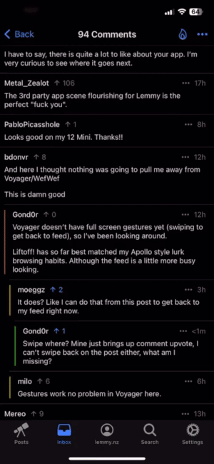
And here I thought nothing was going to pull me away from Voyager/WefWef
This is damn good
Voyager doesn’t have full screen gestures yet (swiping to get back to feed), so I’ve been looking around.
Liftoff! has so far best matched my Apollo style lurk browsing habits. Although the feed is a little more busy looking.
Gestures work no problem in Voyager here.
It does? Like I can do that from this post to get back to my feed right now.
Swipe where? Mine just brings up comment upvote if I’m on the comments, I can’t swipe back on the post either, what am I missing?
Swipe from the edge of your screen. Starting in screen is the upvotes, a swipe that starts off screen takes you back.
Thank you for that!
But yeah, that’s not true to Apollo’s full post swipe back option. I have to put my phone down to reach over to the left edge in Voyager.
I upvote comments a few times per year, but need to get back to the feed multiple times per session.
Hopefully gesture options come out in the future.
Hey, one of the Mlem devs here, Welcome to the club. Be advised we are hitting issues getting on the AppStore, apparently Apple says that we are “exploiting the popularity of the Lemmy trademark”. You might have to deal with that once you submit… Good Luck, Your app is looking good. ❤️
It sometimes makes you wonder if the App store employees think before sending pushback like that.
The latest episode of ATP had a big rant about how fucking stupid app review is. It honestly seems like it’s being done by ChatGPT or something it’s so fucking stupid.
Does it have Apollo’s full width swipe back? That’s the one thing I have yet to see implemented with any other app ever. As someone who just broke their wrist it’d be a damn godsend.
I really want this too actually, but I honestly have no idea how Apollo did this. Might have to write the whole iOS-navigation-UI-stuff from scratch which is a bit much. I considered adding a floating back button of some kind - not quite the same, but fewer broken wrists hopefully.
Here you go. It was a custom implementation but i don’t know enough about iOS development to say how difficult it would be to implement.
Liftoff has this feature. You just need to do the TestFlight build
Ooh thank you
Just got liftoff, it’s so perfect!!! Thank you ❤️
Hmm, what do you mean by this exactly? Dragging from anywhere on the right-hand edge of the screen?
In Apollo there was a setting that allowed you to swipe to go back from anywhere, not just from the edge of the screen. Super nice if you have a large phone since you don’t have to stretch your fingers as much.
Just downloaded it and the interface is stunning. The app is fluid and smooth, I’m surprised it’s so polished. Nice job!
Really glad to hear that, worked hard on polishing the core stuff and making the app as smooth as possible. Thanks!
I’ll check it out. Thanks for your hard work!
Summary of me looking at the app for about 20 minutes:
Having subscriptions as it’s own tab is confusing as hell to me and leads to a weird UX as the UI first needs to switch to the posts tab before triggering the navigation there. This results in a harsh change of the content followed by the pushing of the new screen. Took me a while to realize what was happening as I thought there was a bug that added images to the subscription rows as this happens fast enough to not make you realize you are seeing Posts/All for a split second.
All/local/… does not react to changes in the set post style. Pull to refresh will not help. Only switching via the Navigation Bar menu will update the post layout.
While we are at it. A preview for this setting would be great.Switching to the account tap will always return you to the first screen and not the sunscreen you were on previously. At least that problem does not exists for posts.
Guests instances could really use an explanation about what they do.
The NavigationBar is very not iOS like.
The back button should have a meaningful label and having no title until you scroll feels wrong. I think you are trying to emulate the butchered detail view of the mail app, but without the back button text this just feels empty but adding it might be enough to make it work.Also there is a UI bug when the navigationBar (dis)appears where the back button vanishes first/gets added before the bar appears.
Tapping next to the comments count beneath the post sometimes collapses/expands the post. Sometimes not.
Sorry if I sound a bit harsh. I see a lot of potential in this app. But also a lot of work.
Onboarding is pretty great though.Keep on keeping on!
The onboard flow is bar none the best in the Fediverse. UI is great too.
I think the UX, especially the tab choices and arrangement, are sub par. In particular, I would rethink some of the tab drill down. Subscriptions on the left when the default state is to not be logged in, is weird. I think I would hide that entirely until a user is logged in, or find a better way to default to or drill into your subscriptions after logging in.
Arrangement definitely looks off. The icons should have the same distance in between and the labels should just overflow. Also stretch more to the edge
I’m quite a fan of voyager (née wefwef), but out of curiosity, I tend to install all lemmy apps and give them a whirl.
I have to say, there is quite a lot to like about your app. I’m very curious to see where it goes next.


![[Self Promo] I've just made Avelon (a native iOS app for Lemmy) available for download!](https://lemm.ee/pictrs/image/079c29a1-ce88-447f-9b8e-f3c826866833.webp)