
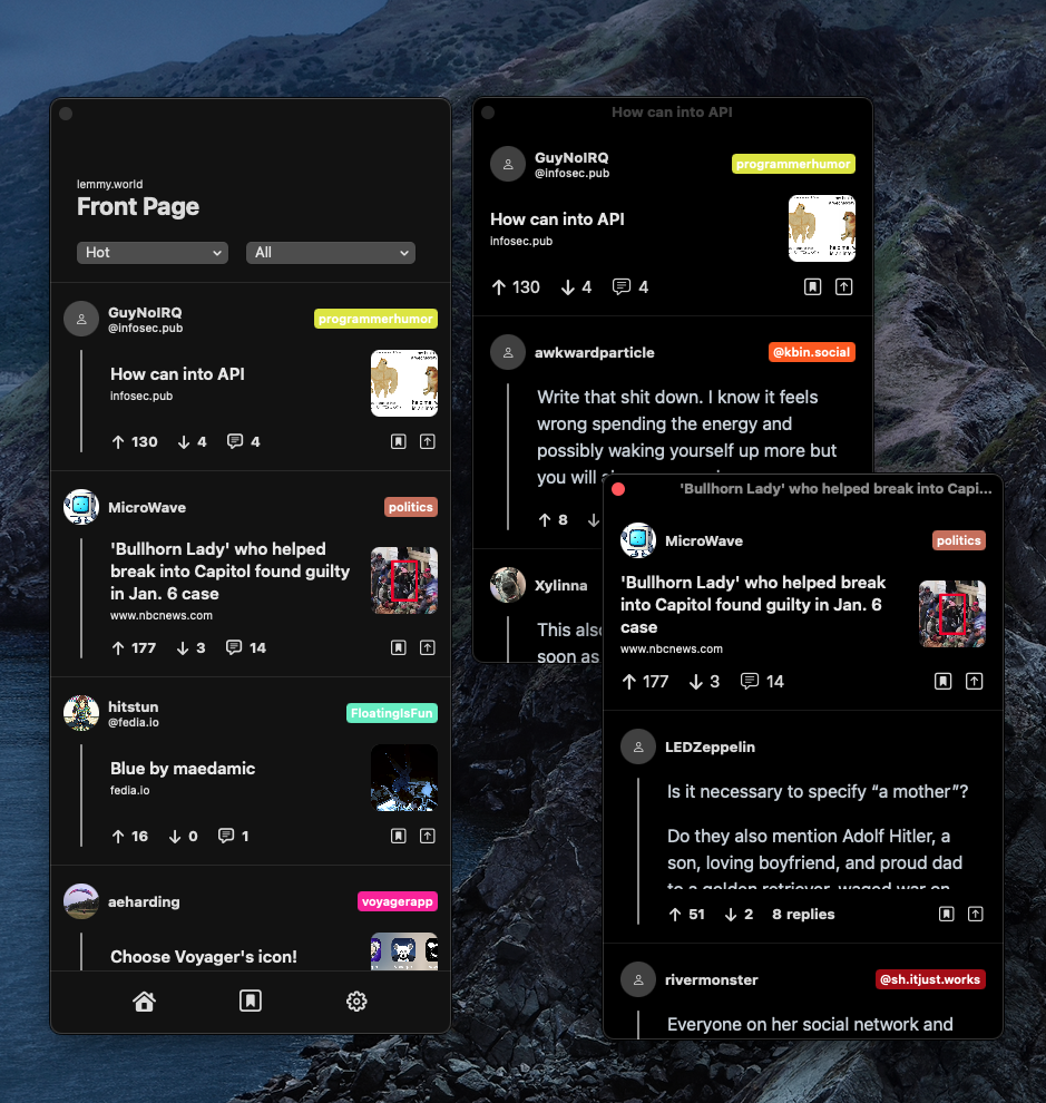
Been building out this application with some features I’ve always wanted in other readers. Like that experience shown when viewing comment threads and some others. Few more key components are left, like accounts and mod view.
But was wondering what everyone’s thoughts are and whether they like this design approach.
That’s a very interesting thread browser. I would never have thought of that. I like it.
And a comments feed like in the webUI. I hadn’t even realised Thunder was missing that. Now I really want to implement that.
Less a fan of the posts basically being identical to comments in appearance.
Thanks for the feedback! For the comments feed were you referring to the bookmarks? Yeah I really like to save comments and browsing through them as if I were looking through a catalog of quotes on goodreads, having it look like a feed was nice. And about comments looking like posts. I see what you mean, I’ll think of a way to make them feel unique. I’ll need to try out Thunder soon too, I have another idea I haven’t seen yet, about content uploading when I get around to it, I’d wonder what you’d think about it.
Very interesting take on thread browsing! I’m not sure if I caught it in the video, but do you have to click on the parent comment to view the children comments in the breakout viewer? Or can you still view threads like normal (Apollo style, if you will).
I’d prefer a both/and approach. Perhaps Apollo-style as the default with the ability to pop out a thread (as you’ve done here) if I really want to zero in on it.
Really great work. I’ll be following this closely
Thank you for the feedback and kind words!
I only have it pop out for now. But I can add the normal apollo style experience. I can make it an option in settings and/or add a gesture to trigger each. Like a long press gesture for pop out but single tap for the other
Awesome! Choice and toggle options are always good :)
Hey there, I finally feel the application has reached a relatively stable state. So wanted to share the TF link: https://testflight.apple.com/join/owwIagmV and open source repo: https://github.com/neatia/Loom for more details! Hoping to make another post sometime soon when all the base functionalities are implemented (Mod mode, etc)
Sleek! Feels focused on the actual content so, that’s a good one in my books. Font alternatives/options might help for more content on the screen (compact feels easier to handle for me as there is less scrolling).
Happy coding!
Alternative font systems is interesting. What font do you have in mind? I could add a settings option to customize fonts and/or font sizes. For the compact feel how many posts would that be per page? On maybe a iPhone 13 Max screen.
And thanks for the feedback!

For fonts, not really picky, like Roboto works well with web renders. But my point is that there should be font size options like small/large etc. I find it working well on Memmy app.
7-8 posts on iPhone XR (my testing phone, I don’t have the 13).

Oh yeah, definitely can try the font sizes. It should also make things dynamically resize properly to your taste
Yes! Enthusiastically yes!
We will watch your career with great interest.
Awesome, thinking of creating/setting up testflight this week
That’s actually the most unique browser for comments I have seen.
I would definitely be testing this out on release.
Good work!
Thanks! I will let you know when the testflight is ready
Hey there, I finally feel the application has reached a relatively stable state. So wanted to share the TF link: https://testflight.apple.com/join/owwIagmV and open source repo: https://github.com/neatia/Loom for more details! Still some quirks and bugs that need to be resolved, but lately I have been focused on a seamless content consumption.
Could be interesting to see the macOs render. We’ve seen dozens of iOS clients already, I haven’t seen any macOs desktop one
 The design isn’t up to date. But, I sorta liked the idea of keeping it compact but each post and comment thread can open into separate windows if you want to keep something alive while doing something else. What do you think about this approach vs. a normal sized window/resizable window with a custom MacOS experience.
Edit: To be honest, I’ll definitely make it resizeable and mybe the tab bar moves to the left side so the main window feels more “Mac App Like”
Hey there, I finally feel the application has reached a stable state I pushed details and download for the macOS app in this open source repo: https://github.com/neatia/Loom . Feel free to let me know what you think!
jealous for iOS users. no plans on supporting Android?
Since it’s Native SwiftUI, it won’t be cross platform initially. But, I can either try myself to maneuver into Kotlin effectively or someone can replicate it to Android with the open-source repo I’ll publish with it/