
As the title says.
Other folks have suggested to use the reply button in the context bar at the bottom of the comment, but if you’re asking this question I assume it’s because you don’t see that bar at all.
A recent update changed the behavior of this bar to hide it by default. In order to show it, you need to:
- Find the username of the commenter in the upper left. This defines the height of the top-bar.
- Long-press the whitespace in the top-bar to the right of the username. Make sure to hit white space, if you tap the username or one of the other linkable elements of the top-bar something else happens.
- If you have tactile feedback enabled on your phone, you’ll feel a vibration and/or hear a click as the bottom-bar appears. If the comment is lengthy, the bottom bar may have appeared off screen… and if you have tactile feedback completely disabled you may get no indication this has happened. Now that the bottom-bar is visible you can click the reply icon.
I’ll be honest, I hate this change. The first thing I do with a comment in my inbox is reply or mark it read using the bottom bar, so this is an annoying extra step that takes longer than either of the short taps requires to do those things. Also, I’m CONSTANTLY tapping the username or something else that takes me away from the inbox. I’d much prefer the bottom bar was always displayed. But this is the required sequence for now.
Thanks for this… I honestly thought it was a bug of sorts and commented as such somewhere below.
This is a pretty poor usability design decision and hope they reverse it.
I honestly thought it was a bug of sorts and commented as such somewhere below. This is a pretty poor usability design decision and hope they reverse it.
Yeah, I’m with you. It’s so confusing and inconvenient it might as well be a bug. Here’s hoping for always-on bottom-bars again.
In your inbox, you may need to long-press the comment or message to have the options appear. Seems to be a strange regression in v34alpha.
Click on the “reply” icon haha!
Doesn’t show up by default. Another user explained it though. Thanks!
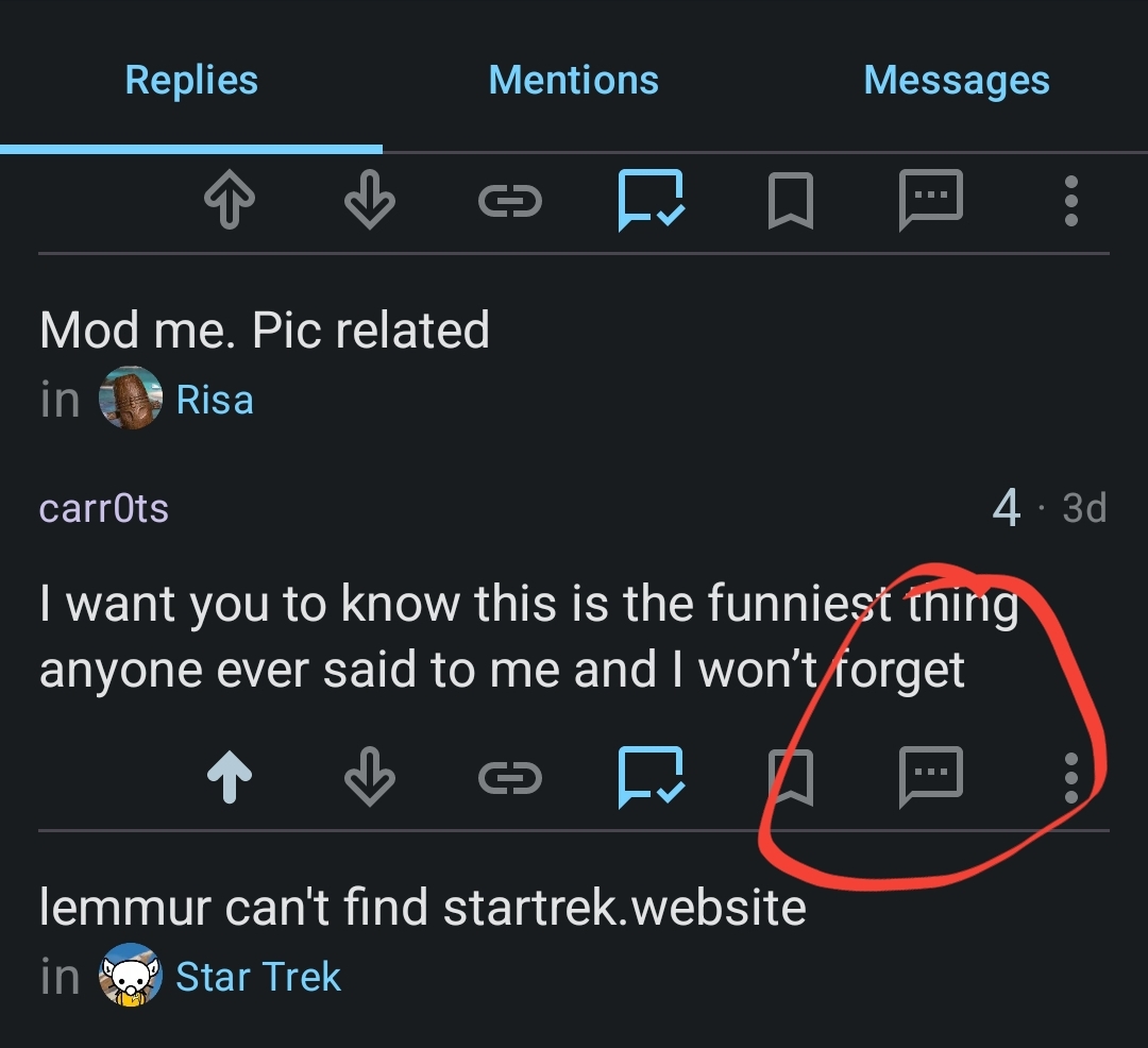
Click the reply button, as shown in this screenshot.
Thank u, got it to show up with a long press on the top bar.
No clue, it seems you can’t ?!? I have the same question
Long press next to the user name (in the reply) to bring up more options. Apparently it’s a bug.


