
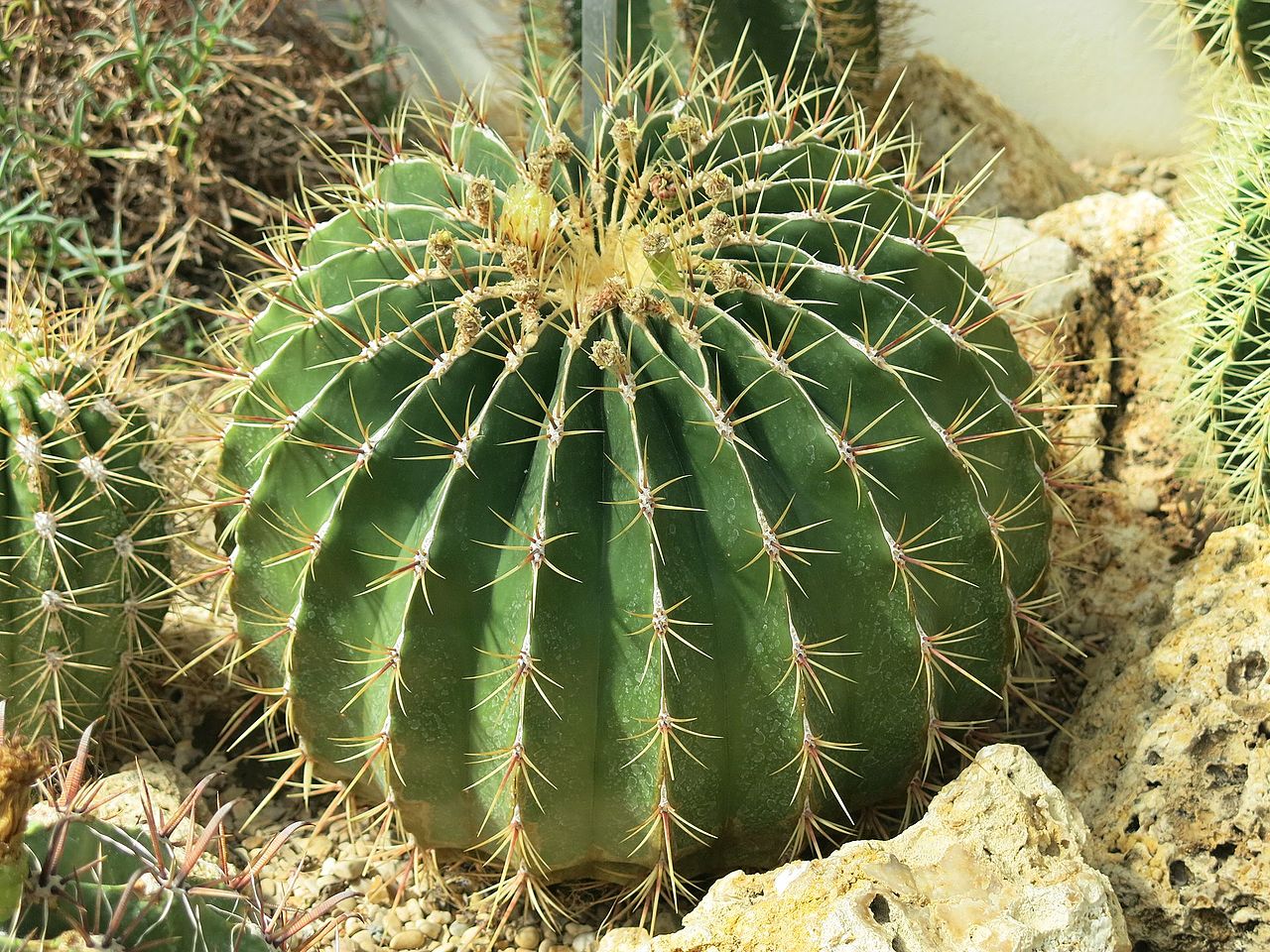
The first pic is unedited, and here’s the version I played with a bit, what do you think, is it too much?
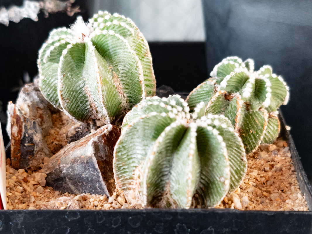
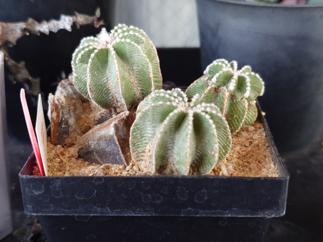
Here’s a few more, should be clear by looking at them, but unedited version first, edited one after:
1:


2:


3:

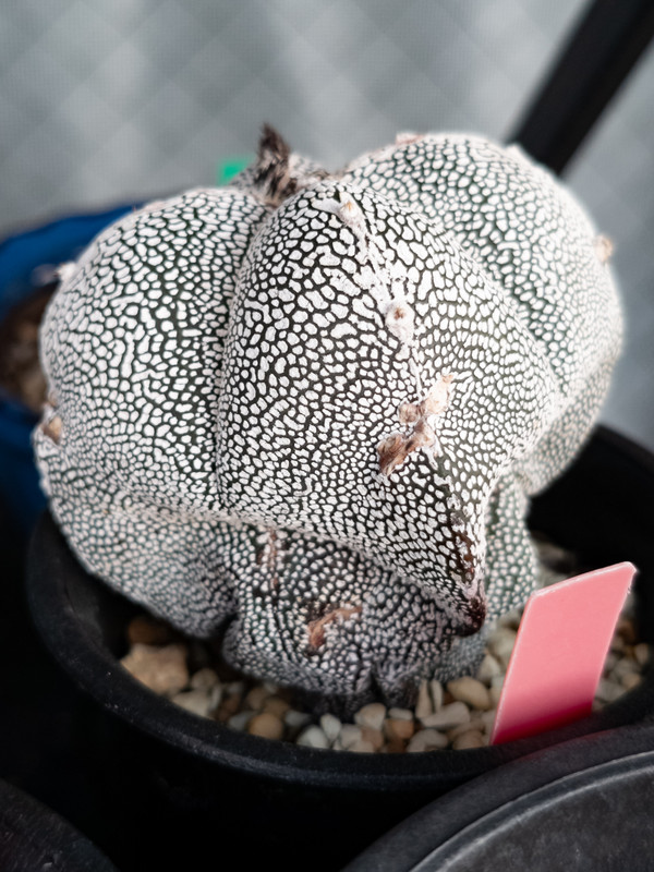
I think I might have gone overboard with the Aztekiums (first pic), but other ones look kinda nice to me. Still a lot to learn though, one day I might be able to show how pretty these are in real life!
a small tip from someone that has been at this for a while.
watch your highlights when you’re pushing the contrast. you have some very delicate texture and detail in the whites on those plans the you don’t want to lose. try pushing your highlights and shadows separately, if you aren’t, instead of using the contrast slider. that way you can push the shadows down more than you push the highlights up. creating the same amount of contrast while preserving the highlights.
of course, the same can an be said in reverse for shadows. it’s all a balancing act.
Great tip and good point, thank you very much! I’ll definitely keep that in mind!