

Mine have always been a bit functional, and I’m curious what more creative people have achieved.
Anyone fancy showing off what they’ve put together? Feel free to blank out personal information, obviously.
And on another note, I’m now moderating this sub. Hi!
Let me know if there is anything you’d like to see added to the sidebar, I’m aiming to update it over the next few days.
You must log in or register to comment.
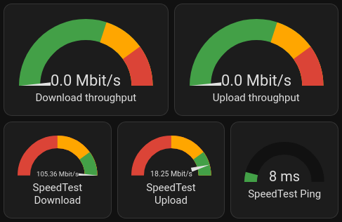
My “What’s the internet connection up to?” card:
My “Leaving the house” card:

It’s nice to compare the local predicted temperature, and local sensor.Drive time to work is a great idea!
Currently, it’s using a Waze integration.
The coolest thing, is that it’s given me a really nice data set for when are the bad times to drive across town are. (Sadly, it’s during the morning and afternoon school runs).
It also reveals that the travel time on average is impacted significantly by the school holidays, and the weather.
Ooooooo bby.
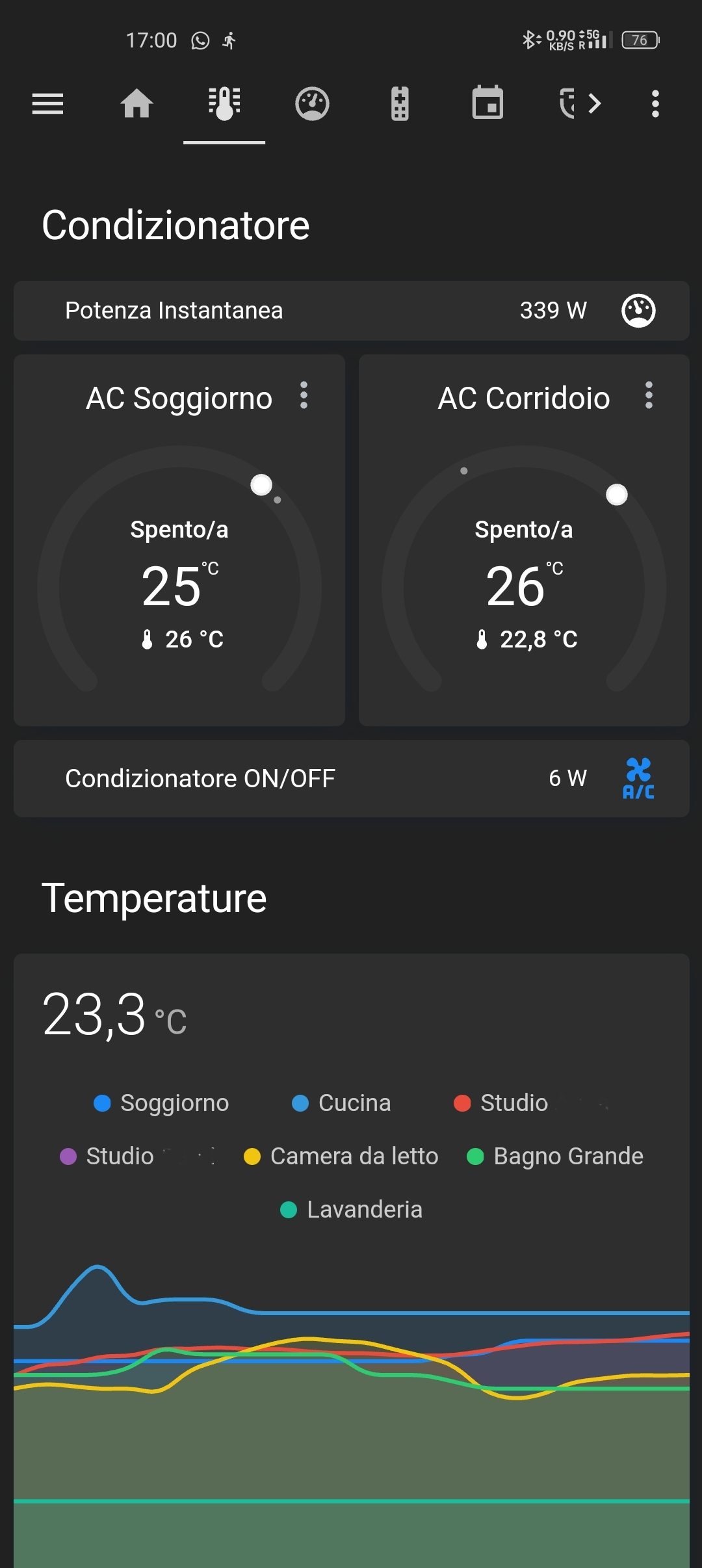
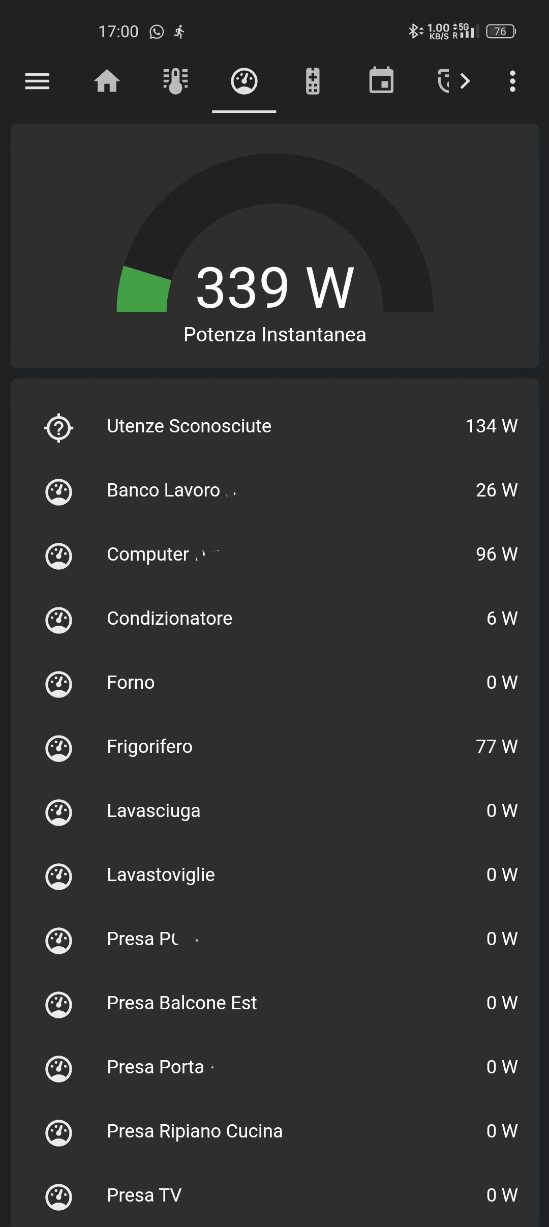
What integrations did you use for all those lovely dials and what config did they need? I would like to shamelessly copy!
Good news: The gauge card is a standard component.
It is indeed! Mostly just fiddling around with the settings.
@smeg@feddit.uk, here is a paste of the config so you can play with it:
(If you click show code editor, then paste in, you can then go back to visual editor with things configured)Speedtest needle gauges and ping with colour change:
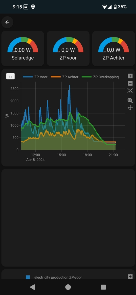
type: horizontal-stack
cards:
  - type: gauge
    min: 0
    severity:
      green: 80
      yellow: 50
      red: 0
    entity: sensor.speedtest_download
    max: 100
    needle: true
  - type: gauge
    min: 0
    max: 20
    entity: sensor.speedtest_upload
    severity:
      green: 16
      yellow: 10
      red: 0
    needle: true
  - type: gauge
    min: 0
    entity: sensor.speedtest_ping
    severity:
      green: 0
      yellow: 15
      red: 20
    max: 100
Air quality with lots of different colours:
type: horizontal-stack
cards:
  - type: gauge
    entity: sensor.oxford_air_quality_index
    needle: false
    min: 0
    max: 500
    segments:
      - from: 0
        color: '#00e400'
      - from: 51
        color: '#ffff00'
      - from: 101
        color: '#ff7e00'
      - from: 151
        color: '#ff0000'
      - from: 201
        color: '#8f3f97'
      - from: 301
        color: '#800000'
    name: 'Air quality: PM2.5'
    unit: µg/m3
  - type: gauge
    entity: sensor.external_environment_f
    max: 40
    severity:
      green: 18
      yellow: 25
      red: 30
    needle: false
    min: -10
  - type: gauge
    entity: sensor.oxford_uv_index
    max: 10
    severity:
      green: 0
      yellow: 3
      red: 6
Once you’ve got your head around horizontal stacks (lets you put multiple small dials together), it’s mostly picking thresholds and settings colours.
@GreatAlbatross @homeassistant I love a good gauge 😀
Cheers! I’ll let you know if I get it working (in several weeks when I actually have a chance for tinkering!)
I’m glad I glanced in here. I recently deleted everything and had to start again, but MET office was broken on my old install so I never tried again.
Your screenshots made me reinstall, and my phone remembered my Met office logins (bonus) so it took seconds. And it works!
It was broken for a few weeks of 2024.2 (I think). I ended up learning how to do a manual downgrade while they fixed it!

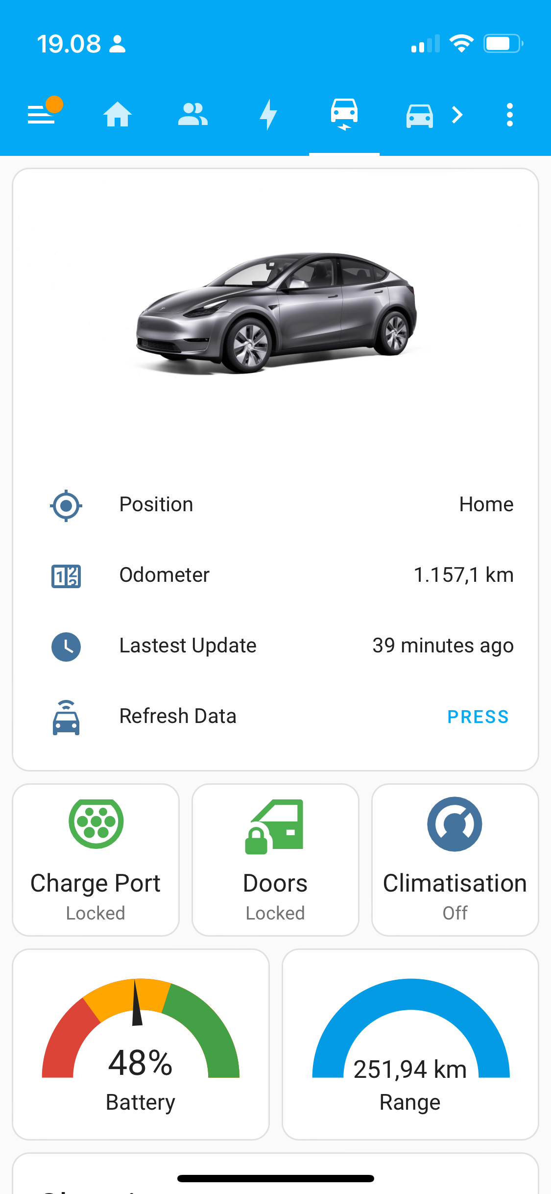
I have this one on a wall mounted tablet.
- Left column:
- time and date
- solar battery level
- car battery level
- solar production vs. load
- camera of the entrance
- Middle column:
- current weather as measured by my weather station
- forcast for today
- list of open windows and doors
- (not shown) any emergency warnings (storms, etc)
- scheduled garbage collection for the different recycling types
- Right column
- warm water boiler control (override for the automation which turns it on only in the morning)
- current temperature in the boiler
- turn on/off the car charger (until I come around to automate it)
- List of devices that need their battery replaced
- rain radar
These are the most important values to be shown in the hallway. There are other dashboards for other situations…
I like the low battery panel. I might copy that. I have a general overview over all batteries, but it didn’t occur to me that I could filter the values and show only the ones needing replacement.
Hej, could you share what kind of solar integration you use? I’m struggling to find a solar solution that integrates well with hass
Not OP, but take a look at Open Energy Monitor - I use EmonPi which is a Raspberry Pi based system with current detection sensors
Uses the Emoncms Integration to read the data into HA.
You can also embed it’s own webUI into HA with a webcard
Yeah, I have blog post on that: https://www.splitbrain.org/blog/2023-11/03-growatt_and_home_assistant
- Left column:

Main page of dashboard

If you long press on a tile (this is kitchen)
Mine’s mobile-friendly:
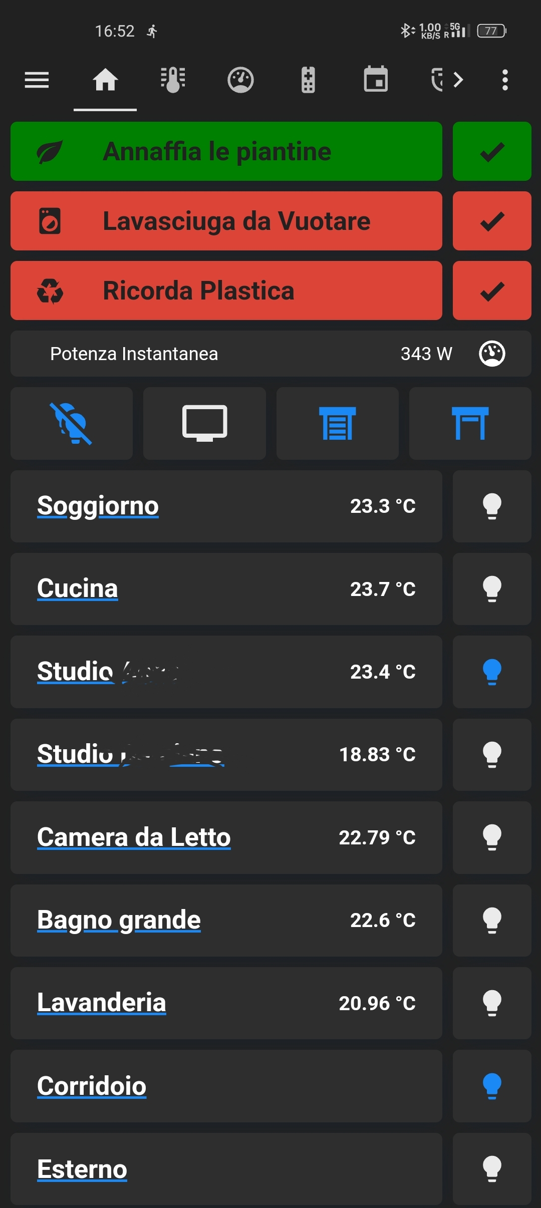
On top are reminders and common buttons, such as turn off all lights, open/close all shutters.
In the main body, each line is a room, the bulbs next to the room either turn off all lights in the room or turn them all on. If you press on the room name you can expand that room and control the devices inside:
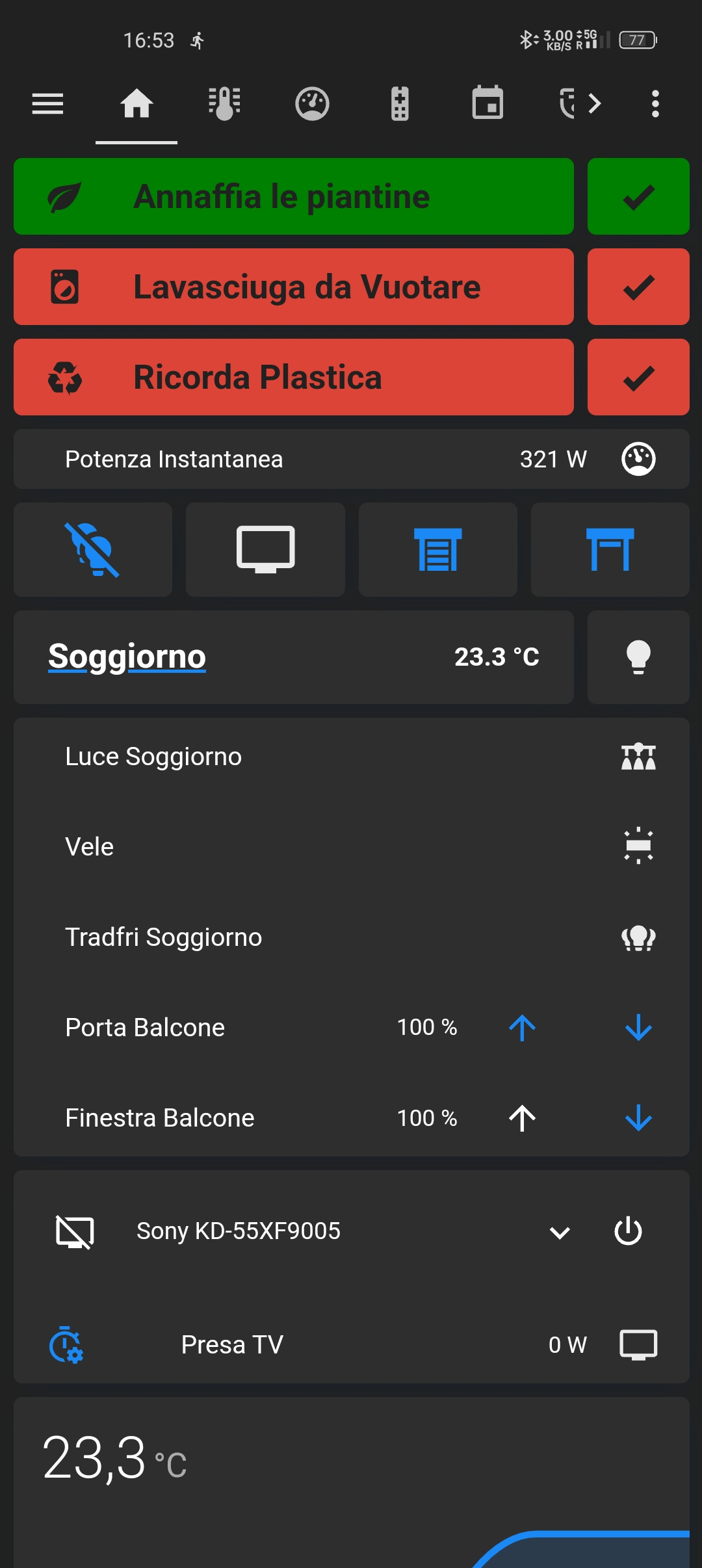
Some devices can be expanded as well:
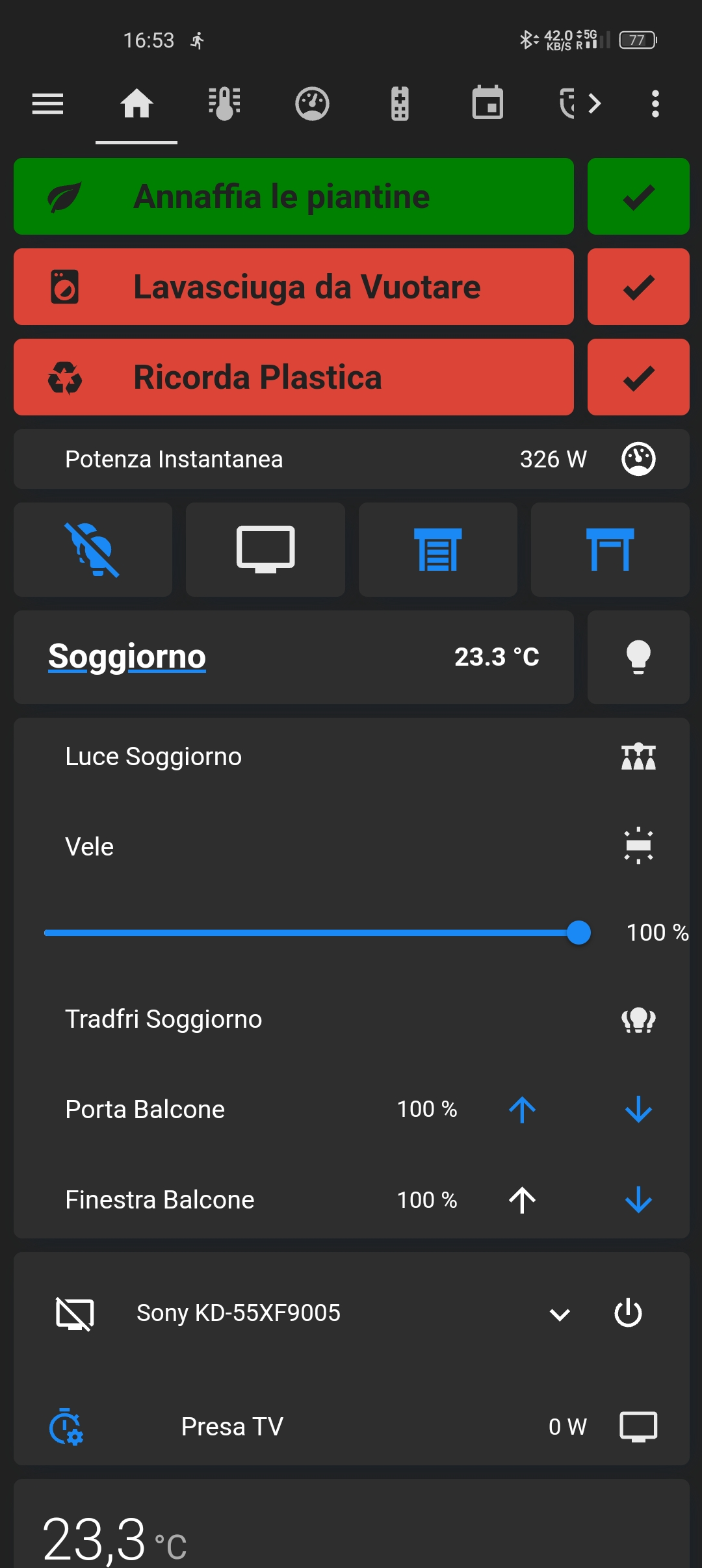
I also have pages for climate control and power management (the last one was created before HA implemented their own “Energy” page):
Recently I’ve started integrating my 3d printers in HA, but it’s still pretty rough. Super cool to have them light up when I walk in the room tho.
What are you using for reminders and what cards are those? Need this to not forget the trash 🤓
They’re all custom:button-cards with specific css and conditional cards to make them appear/disappear
I like the expanding room cards. Can you share how you’re accomplishing that?
They are conditional cards that whose condition is activated by pressing the room name. Unfortunately the only way I have found to pass a condition is to use an input boolean helper, which means that when one person opens a card, it opens for all users. Not a huge deal but annoying; I’ve asked for alternatives on the HA forum but I received no satisfying answer, the best solution would probably be to create a custom card.
You could check out expander card. I use it for a weather section on my dashboard.
https://github.com/Alia5/lovelace-expander-card
Editing the card is really buggy for me and I’m not sure the project is still open, given the note at the bottom about the issue tracker… but after it’s configured, the card has been very solid.
Thank you
If you do end up trying it, let me know if you run into the issue of the UI constantly “refreshing” while editing and ruining your changes. I’m not sure how widespread the issue is.
Cool! Perhaps you want to censor all photos :)
Right. Not that it matters anyway, you can’t delete images from Lemmy servers.
Still want to add a few bits of info to it, but I’m pretty happy with the dashboard for my kitchen display that sits on top of the fridge where I can see it from the living room as well:
Uses the excellent LCARS theme by th3jesta via HACS.
Almost everything shown is just standard markdown cards, with minor tweaks by card-mod, with the exception of the 2 weather widgets shown (also via HACS):
I have this
Are those shortcut buttons? How?m
It’s using Mushroom from HACS. I followed a tutorial: https://youtu.be/A0fMt8IRKoI
deleted by creator
Each of the rooms has their own dashboard you can access by dubble clicking it, the energy Dashboard’s is still a wip.
Tempratuur AAAAAAAAAH Having to see this everyday would drive me insane!
Ohh I see the typo. Yeah I am a bit dyslectic and read over these things.
Not judging, just sharing my ocd hehe
No worry’s. Good catch though. I have just updated it to “Temperatuur” :)
This is my “power usage page”
And my car card
Only my first page 😅
Got other pages for specific functions. Not room based. Media, heat pump, server stats, climate inside, energy prices and usage per fase, adaptive lighting…


What graph card are you using?
My default dashboard is maybe a little bit unusual:

It’s the blood glucose levels of my daughter (and mine in the next tab) as we are both T1 diabetics. The levels are transmitted via a tool called Nightscout and then shared with Home Assistant. This allows my wife and myself to get notified via light signals at night (in addition to the alarm her blood glucose sensor sounds). The dashboard also contains average levels for several timespans as well as an estimated long time level (Hb1Ac).
The second dashboard is an overview of all the lights, sensors and appliances located on a floorplan of the house:
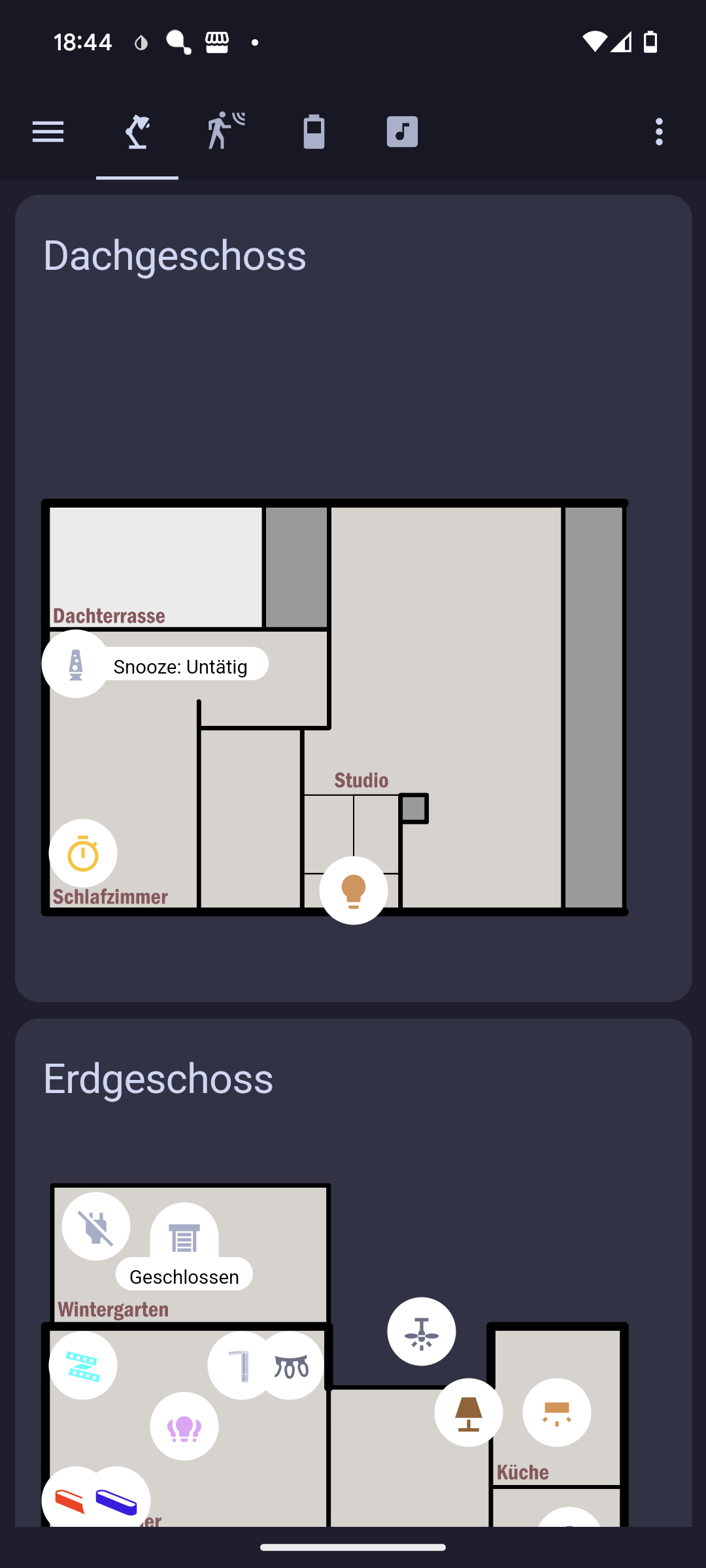
There are several tabs grouping lights (and appliances), sensor readings and battery levels.
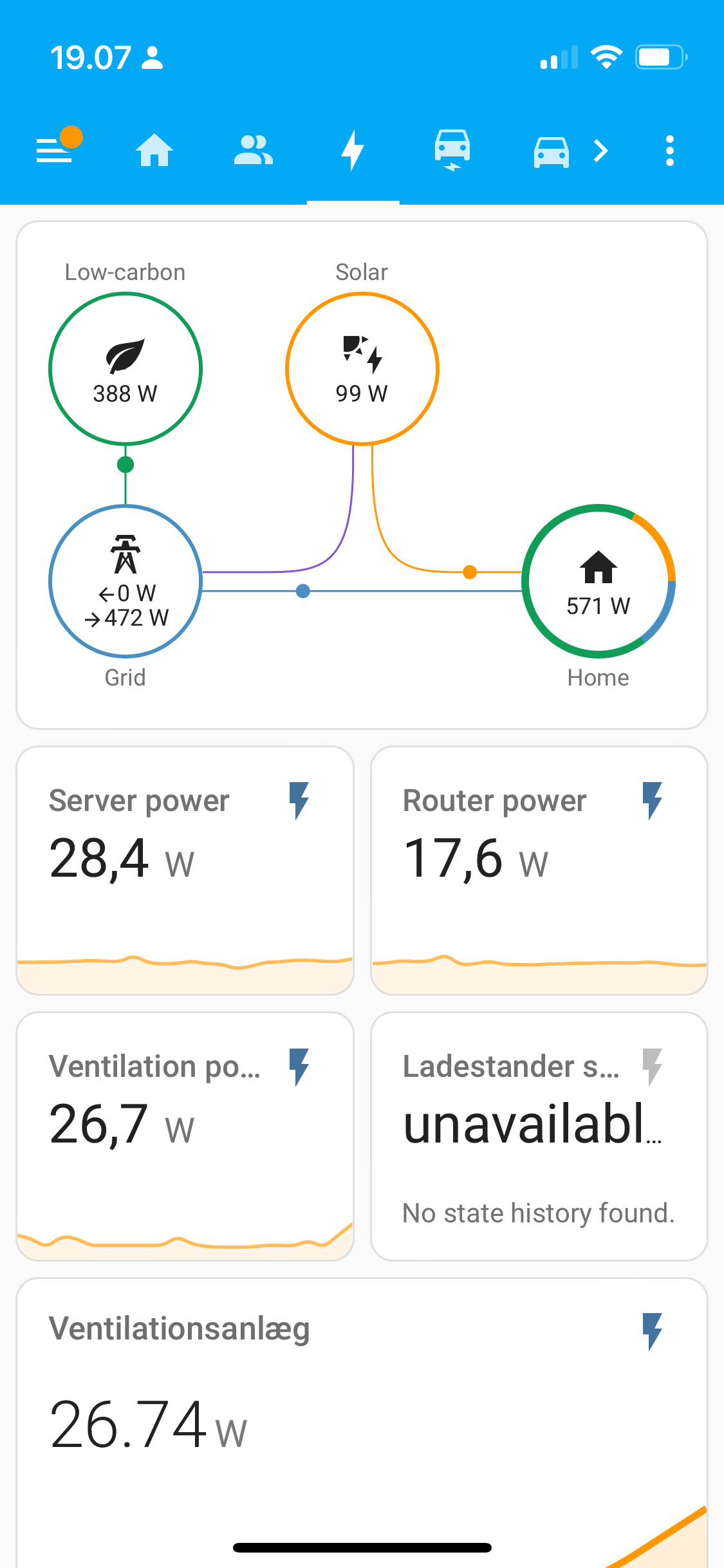
A graph for PV production (green), Grid import/export (red), home power usage (yellow) and wallbox charging power (cyan).
Some power-related Sensors. Then window shutters, then settings for Car max charge and wallbox max. from-grid power usage.
Still working on being able to change the wallbox mode between PV/max power. Does anyone know good card for a Enum selection card?


Here’s mine, slowly been simplifying it. Now just have mushroom cards, hue like light cards and mini media player to control my most used devices. Plus I rent so don’t have a smart thermostat or other rain or garage sensors.


I’d post mine but it’s just the default overview. I really should put some effort into making something good.
Mine’s here, a few things have been modernized since I last updated but general functionality is about the same.
I went for the floor plan approach. Overall this works well for me to do a quick visual check of the house, and to easily track down any given control. Though I need to clean up a few old entities.
Should be noted: I still try to automate as much as possible with room-specific presence detection, and still have functional physical switches for lights.