
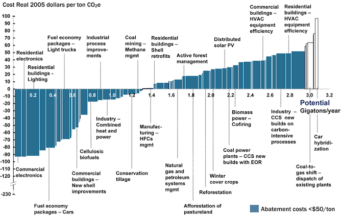
As you reduce the amount of carbon emissions (the y axis) the methods to keep reducing carbon cost more (the x axis.)
This great graph came to my attention from this video from vlogbrothers. It also has some good explanations of what it means.
Note that carbon capture doesn’t really make sense till you’ve exhausted all the other emission minimizing methods.
Source: https://www.edf.org/revamped-cost-curve-reaching-net-zero-emissions
If you need a video to explain your graph, is it really that good of a visualization?
I thought it was beautiful
I do think it’s beautiful, indeed. There are some meaningful colours piled up forming a column
I’m sorry but what the hell is this figure trying to say?
Its like an inverted stacked area plot, but I’m yet to figure out how I should be interpreting it.
A ‘beautiful’ presentation should be immediately obvious in terms of how to interpret it.
From what I can tell, this is saying that…
I can’t tell what the hell this is saying…
This should not be a stacked area plot. this should be a line plot, and the data surely should not be stacked. I think its a total misrepresentation of whats going on here. These lines are not cumulative, unless you are considering some kind of optimization curve, in which case ‘cost’ should be flipped to ‘price’. But then why is that axis in giga tonnes when it states that it is in cost per metric tonne, then how is it tonnes on the Y axis? Should be dollars?
And even then it doesn’t make sense because the scale of the y axis is backwards. if it was ‘price’, it could be reconfigured to make sense.
Looks like something one of my students would turn in when they are just guessing on how to make a plot in excel without engaging with the material (although its clearly made in R). Remake and resubmit for half credit.
(I’ve read the methods. This figure should be remade by swapping x and y. Y should be labeled cost per mega gram to deploy (and should be in megagrams, not gt), x should be carbon offset capacity. If this was done, it would be easily interpreted as the points and price points (in units of $/ megagram of carbon) at which a given technology becomes cost effective.)
I know up and to the right is boring, but its intuitive and there is no need to have drawn this curve in this way.
The video explains it pretty well. It’s very information dense. But it’s how much it costs to minimize carbon emissions by various methods depending on how many giga tones co2 we are currently emitting.
Just, from a data is beautiful perspective, if I have to watch a video to understand one of your figures; that ain’t beautiful.
Its actually not a super complicated figure, the point its making is just obfuscated by its presentation.
I think why they’re presenting them as cumulative is because you want all the reduction methods to add to net carbon negative.
Giga tones co2 is pretty common from what I’ve seen in emissions documentation, I’ve never seen megagrams used for co2 before, so I thought that was reasonable.
“carbon capture doesn’t make sense” lol
I mean, I’ve been in the industry for 10 years. Sure, when you are talking at a global scale, gt is what you use. The standard unit for projects is megagrams of carbon.
Okay, since this is referring to the global co2 emissions, global scale makes sense.
But is it? Does it?
No it doesn’t, not the way this is being presented. The axis need to be relabeled and rearranged to represent that. Just accept that this is a poor presentation of these data.
The y axis is the global co2 emissions. Where are you getting that it isn’t?
Lol.
No it isnt.
Average annual emissions are 10gt per year right now.
Y here is ‘cumulative’ carbon offset capacity (which is a bit of a misnomer because in their method you ‘stop’ doing things that are ‘cheaper’ at lower cost per unit carbon, which is like, not a good assumption to make, but we’ll stick with it for just trudging through this disaster of a figure).
This is why data presentation matters. People who don’t know what they are talking about or how to understand these things will make the wrong conclusions.
Hmm actually looks like this is only the US. The 5gt is from 2021 when it was published. Yeah that should have been more clear.
But its not just that. Its x axis is in Mg/$.
The figure and the thinking behind it need a complete rework. They would have been better off sticking with the original McKinsey presentation of this concept from 2007.
They’ve made it worse.
Looks to be like the x axis is $/ton? If the original figure is better, could you link it so I can replace the pic?
The originally figure is literally in the article you linked.
This one?
Looked at the graph for 5 minutes and I have no clue what it’s trying to say. Based on the text “cost per 1 metric ton” I would expect a one dimensional chart, not a x/y-axis and definitely not a stacked area chart. Didn’t watch the explanation video though.
You can only reduce so much carbon going to solar or EVs. As you reduce the amount of carbon emissions (the y axis) the methods to keep reducing carbon cost more. (the x axis)
Does the graph starting below $0 indicate some of this is negative cost?
Yes, it’s cost savings to install solar over continue with coal for example.
“carbon capture doesn’t make sense” lol
If across the world enough trees were planted to equal the size of Amazon rain forest, that would be 300 billion trees and 7.5Gtonnes CO2
So more than entire graph.
But you need to plant that every year in perpetuity, while still burying the logs so decomposition doesn’t release the co2 again.
Why would the logs be emitting CO2 (rotting?) if they are alive and growing?
Because they’re only alive and growing till they die and rot. Sometimes trees do both at the same time, rot from the inside out. You can’t just plant trees for carbon capture, you also need to deal with how to permanently sequester the carbon.
Let’s say that for millions of years a healthy biosphere grew around forests and the balance worked. Now you come to tell us it doesn’t. Wouldn’t you think it’s a bit unconvincing?
We’ve only been pumping out co2 for a hundred or two years. We can’t keep doing that and expect the old balance to hold up.
I wonder why forestation is not present in this chart, as it is a low-cost carbon capture with side benefits. Sure, it is hard to scale, but reducing current deforestation rates would be a big step.
It might be included in carbon capture and sequestration.
