

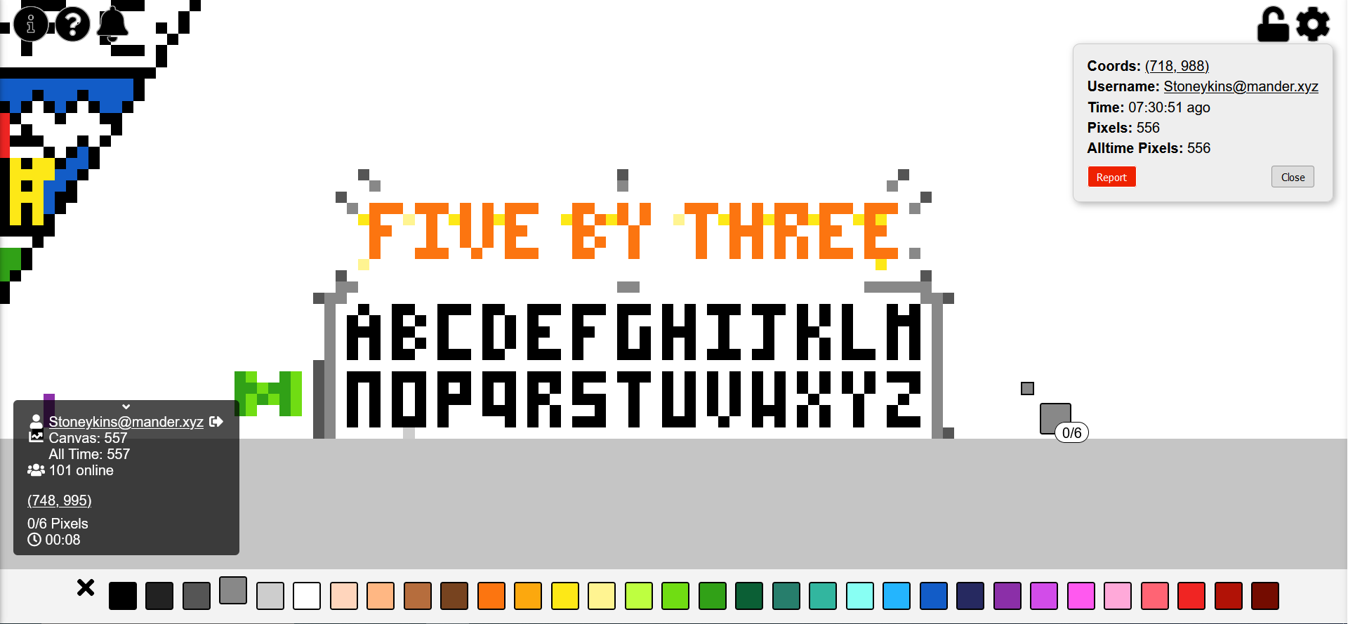
I’ve been doing this. Now everyone will know the superior small block letter font in which every letter fits into 5 by 3 pixels. I challenge you to show me a better small block letter font in which every letter fits into 5 by 3 pixels!
also I’m still trying to make it look nicer but it was taking a while so I figured I should explain why I made this
shoutout to mvirts@lemmy.world I like your green M
update: not done yet, but I wanted to ask people’s opinions on the J. any consensus on which is better?

I don’t like the J. It’s too similar to the I.
⬜️⬜️🔳 ⬜️⬜️🔳 ⬜️⬜️🔳 🔳⬜️🔳 🔳🔳🔳
Better?
lots of the letters are pretty similar, but they are, in my experience, still pretty easy to tell apart when reading. Trying to get them all the same size did make it hard to make them as individual as I might have liked, but I think it has advantages.
i tried making the center of the J down the right side, but it looked lopsided… I didn’t like it.
if you have a better idea for J I’d like to see it (this reads as snarky but it’s genuine lol. I really would like to improve this if possible).
Your J looks good to me.