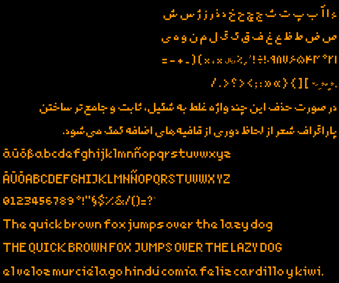
Last year I made a new pixelated free typeface for my 2d game. It has Arabic, Persian, and a subset of Latin glyphs enough for English, German and Spanish texts. Inside the repo you’d find makefile to build the font and generate test outputs.
Since it was my first experience designing a typeface ever, I might have made mistakes not known to me. That’s why I post this, hoping someone would point them out. Here is the repo
You must log in or register to comment.
As a german, I wouldn’t have known that those are supposed to be german Umlauts if you didn’t put it in the text. Having two separate dots on top of the letters instead of a single line would be much better.
I’d go with wide spacing like the Minecraft font, some slanted lines like on top of the n would also work. But I’m not sure if those would confuse non-germans.
Edit: You also don’t seem to have a capital version of ß, which does exist and is a little different in most fonts. Due to the lack of space in a pixelated font I’d just copy the non-capitalized version to make sure nothing ends up falling back to a different font.
Good catch with ß! I’ll fix that.
Regarding the double dots however, it’s a deliberate design choice (constraint). Double and triple dots in Persian glyphs (extended Arabic) are the same.
The rationale is so: I have one base unit which is a fixed size dot which is a glyph itself and every other glyph is made of that. All glyphs also use absolute minimum possible number of dots, and the space between them is also is a multiple of its size. I hope that users could understand it correctly in the context.
Thanks for the feedback, much appreciated.
The spacing is something I noticed, too, and I agree with the umlaut thing. The small “e” looks a little awkward - like it doesn’t quite know if it’s an “a” or “e”. You could try making some tweaks to it. You could also see if adding an extra space inside big V and Y would make them more aligned with the rest of the letters.
I’m sorry, this probably sounds like some font snob nitpicking. On a more positive note, I absolutely adore the small “z”! Real solid work for a first experiment.
Yes, small e was one of the most difficult and as you mentioned needs work. Currently, it’s a compromise to fit it inside a 4x4 space. I’ll reiterate on it and probably post variations later.
I’ll experiment with adding space inside U and V. I wanted to reuse V inside W, that’s why it’s so narrow.
Thanks for the feedback.
PS: and I’m really glad that you liked the lower case z! It was a breakthrough for myself when I came up with the shape on my screen. Didn’t work for the capital letter though. (I also tried to avoid making it look similar to WWII SS signs)
As nottheengineer pointed out, the umlauts being conjoined just doesn’t feel right - your reasoning behind it makes total sense, it’s just a little bit too wrong for my eyes.
I would instead personally prefer them misaligned/asymmetrical (ouch, i know) as that would make what they are clear (i would probably take a minute to adjust to that and imo that’s not something that should be necessary for a typeface.
That nitpick aside, it does feel very well-rounded to look at, you did well!
I’m away from keyboard so can’t really experiment with them now, so I’ll try asymmetric form again, but make no promises :-)
Thanks for the kind words!
When you turn gay out of desperation
Also in addition to my other comment, it would be nice to add the circumflex, forward/backward accents (even if they’re possible just show them before/after the main alphabet in the preview).
Also, ë, ï and why not ÿ to complete the set? :)
Well, I’ve added enough glyphs to cover my needs and languages I understand (and impress my gf!). I was not familiar with the characters you mentioned. Feel free to open a ticket and I’ll get to it.
Regarding the accents and diacritics (as mentioned in the bugs section) I have unresolved problems. I was unable to design them in a useful way using my base square and keep the font minimalistic. I had to resort to a second square 25% of the base square. I want the font to be readable on the simplest of monocolor displays, and they might not render correctly. I have to yet try it though, for example on a gameboy device.
Thanks!
Fair enough, if that’s the scope of your knowledge anyway then it makes sense. Could just be something to add in a later version (unicode wasn’t built in a day after all)!
Would you mind explaining in which scripts/languages those letters are used? (I have covered parts of five Unicode ranges just enough for a 2d game as described in the readme).
I believe (from prior knowledge and a little bit of research), é/è/ê are all french, ë is dutch, sometimes french and occasionally in english, ï is i think similar and ÿ is also french (and possibly turkish? Not sure). No pressure to add them, it just might be nice if you have the time! :)

