
- cross-posted to:
- becomeme@sh.itjust.works
- hackernews@lemmy.smeargle.fans

- cross-posted to:
- becomeme@sh.itjust.works
- hackernews@lemmy.smeargle.fans
You must log in or register to comment.
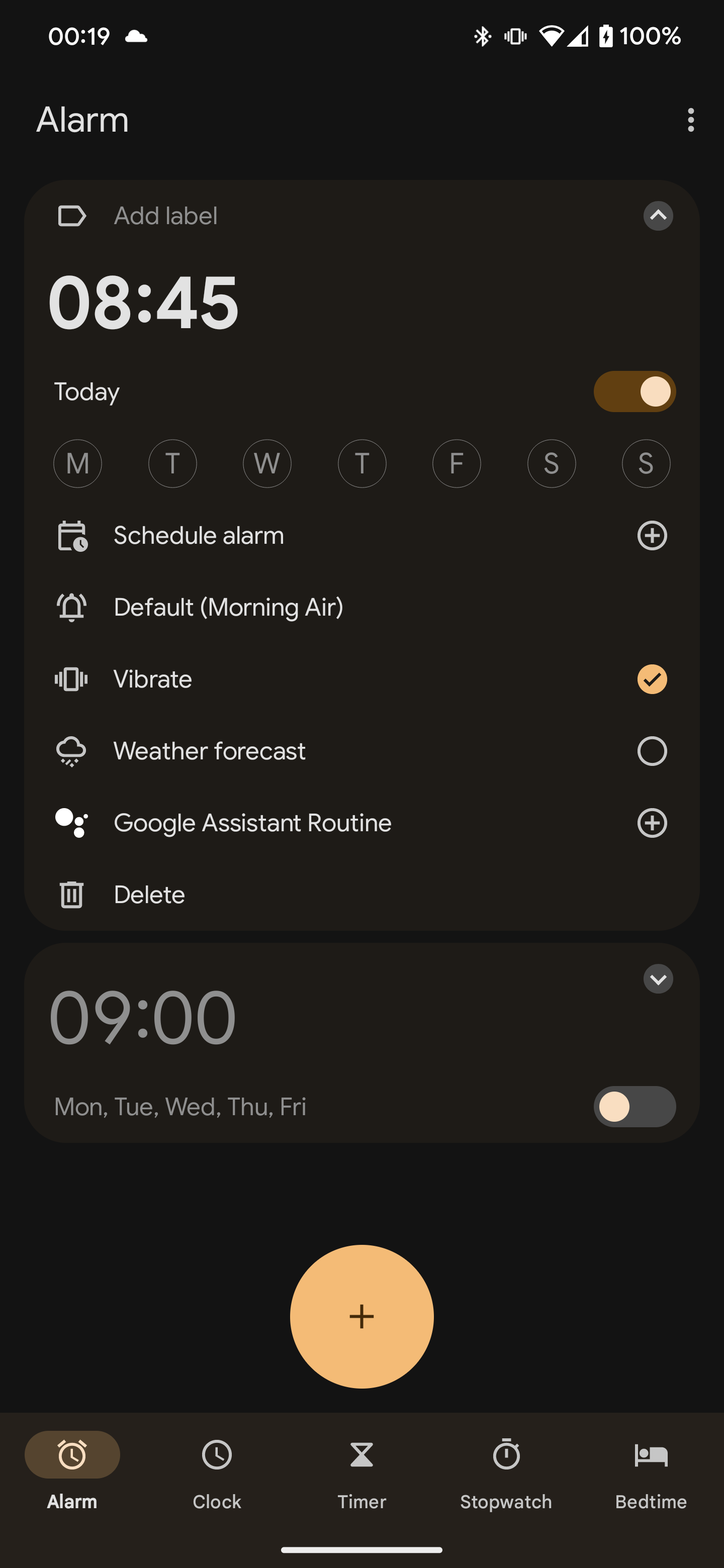
I repeatedly wonder wher the toggle switch comes into play here. Is it more intuitive than a on/off checkbox? Often these things still only have one label (and not one for each state), so where’s the difference?

Any opinions here?
With the wrong color scheme its really hard to know if its’ ON or OFF
And some people are color blind
The background (green in the image) is usually a darker shade than the knob. That’s how you can tell the moving thing apart from the depressed background even if you’re color blind.Edit: Just realized that that wasn’t the point… Thanks, downvoters!
Whatever the colour scheme. Because you’re not in the designer’s mind. Unless they add redundant text, there’s just no way to tell.
I fucking hate those things.
No, fuck these. Especially when you have to actually click and drag them. Even more especially when it isn’t obvious whether it is on or off. Check boxes inherently lack the issue of colour blind difficulties too.
when you have to actually click and drag them
Huh? That exists? I didn’t think I’d have to specify that a toggle should work in a non what-the-fuck-are-you-actively-trying-to-repel-me way
I suspect some gui frameworks work this way. I’ve seen it in a few places and when it happens, every single other thing I can’t stand also happens.
A checkbox is for a form that requires clicking a submit button to apply the change.
A toggle switch should apply the change automatically and immediately without a separate save or submit button.
Chad checkbox vs virgin toggle switch
This post resonates so much with me. Fuck “unique style”, adhere to conventions and don’t surprise the user by “being clever”.
Back in the days when I was in school apple was constantly brought up for their consistent and intuitive user interface. Except for the drag-disc/floppy-to-thrashcan-for-eject.
Those days are long gone - there’s no tech heads left in charge there now, only accountants :(
I didn’t really need another reason to hate Apple, but thanks for providing one.
I never thought about these changes but it’s interesting how there isn’t a centralized convention for web stylization(unless there is I don’t really do that)
There’s the OS and browser default, and plenty of UI frameworks. The change isn’t a trend, it’s more that bad UI designers are more likely to incorrectly override default now that applications are now expected to have unique styling.
Android did it first